-
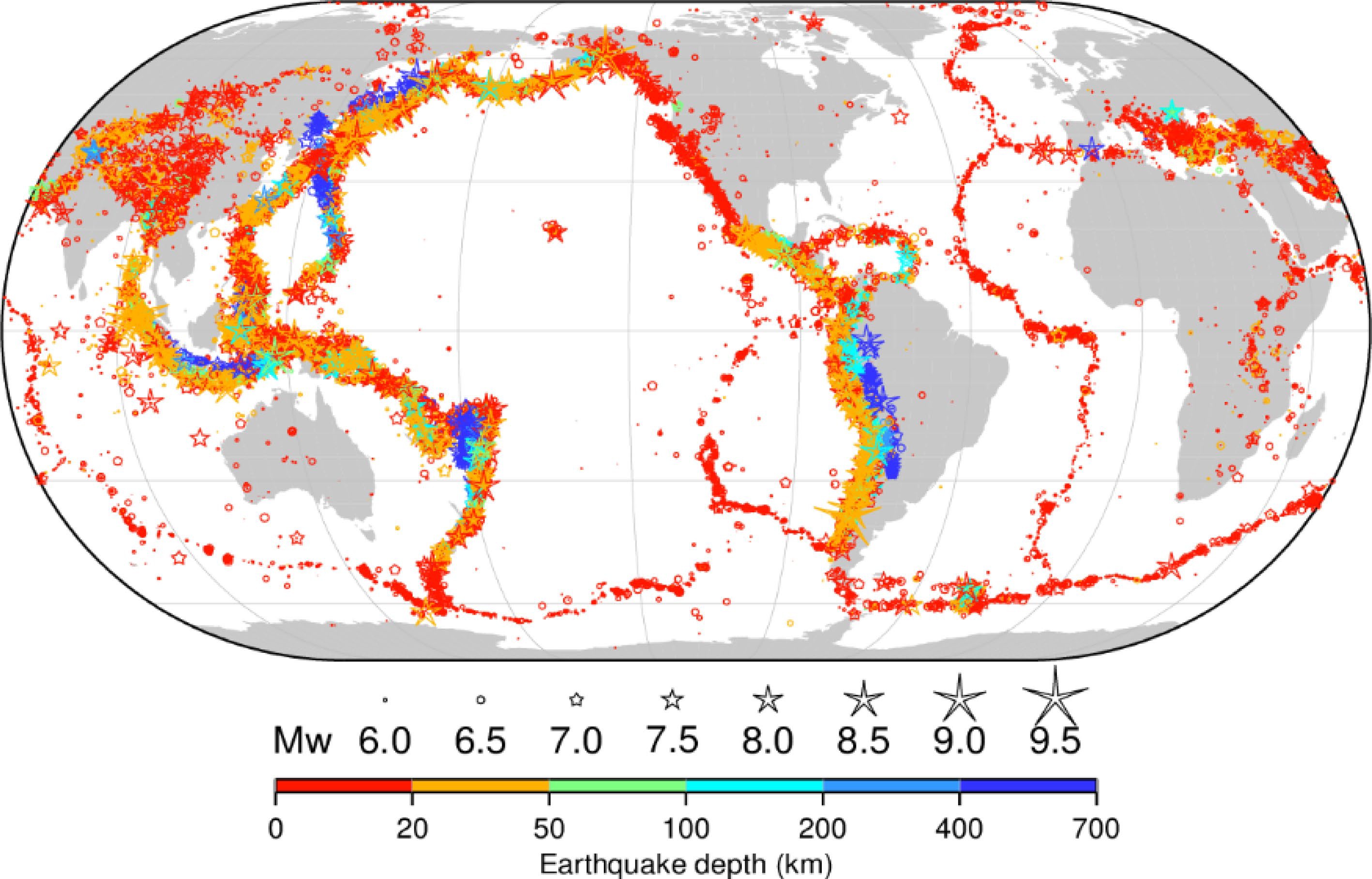
Figure 1.
The worldwide distribution of earthquakes with a magnitude of 6.5 or greater from 2000 to 2023. The figure shows that earthquakes are most concentrated in the following regions: The Pacific Ring of Fire, which is a belt of seismic activity around the Pacific Ocean; the Mediterranean-Alpine belt, which extends from the Atlantic Ocean through the Mediterranean Sea and into Asia; the East African Rift System, which is a series of faults that run through East Africa (Fig. 10); and the Mid-Atlantic Ridge, which is a mid-ocean ridge that runs through the Atlantic Ocean. These regions are all located at plate boundaries, where tectonic plates are moving and interacting with each other. This movement can cause friction and stress to build up, which can eventually be released in the form of an earthquake. It is important to note that this figure only shows earthquakes with a magnitude of 6.5 or greater. Smaller earthquakes occur much more frequently, but they are less likely to cause damage. Source: The International Seismological Centre[40].
-
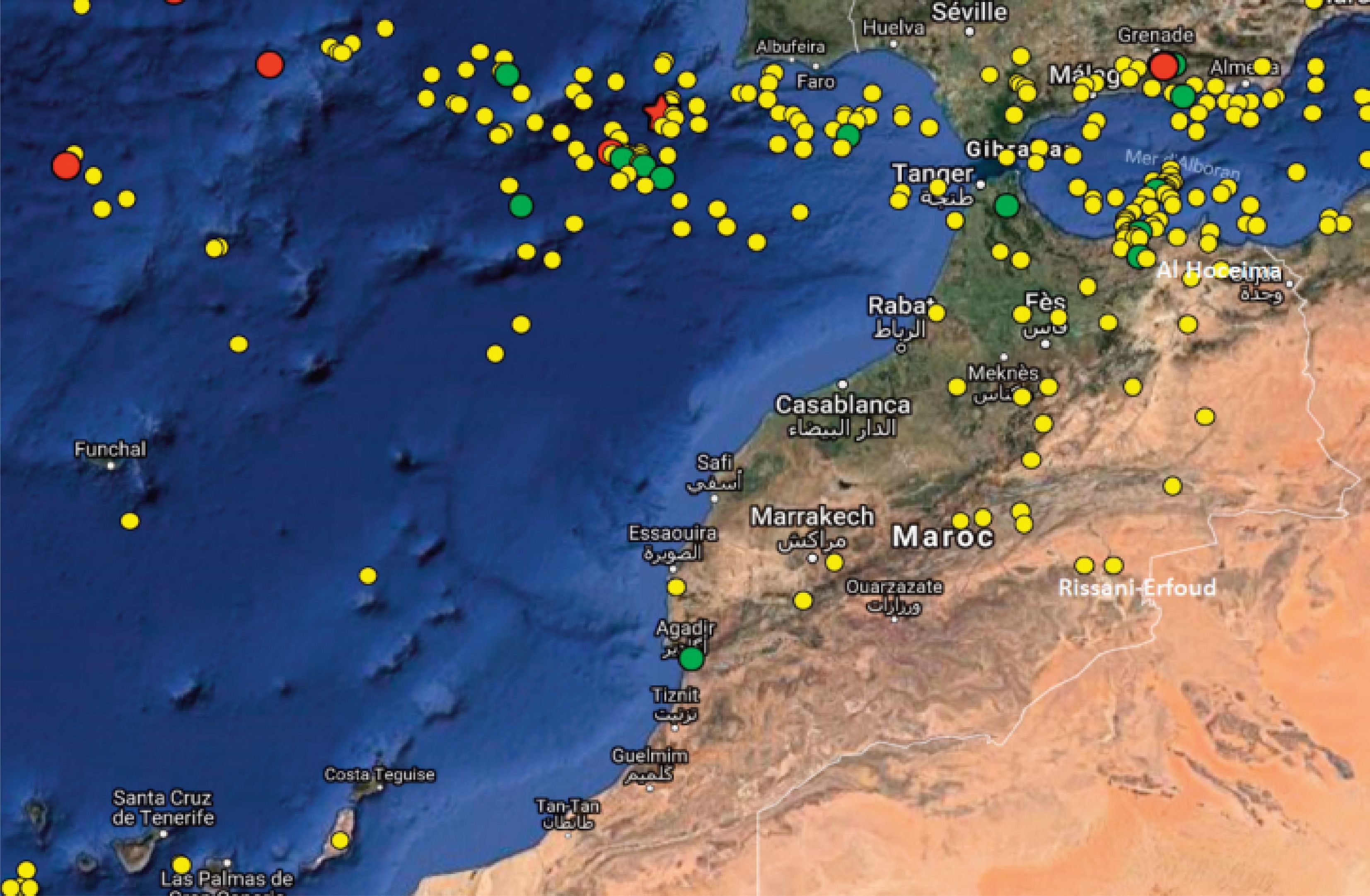
Figure 2.
A seismicity map of northern Morocco and its neighboring regions, showcasing earthquakes with magnitudes equal to or surpassing 5.0 on the Richter scale for the period spanning from 1900 to February 2017. The magnitude of each earthquake is represented by the size and color of the dots on the map, with larger and more red dots indicating earthquakes of greater magnitude. Yellow circles denote events with magnitudes ranging from 5.0 to 5.9, green circles represent events with magnitudes falling between 6.0 and 6.9, and red circles indicate events surpassing a magnitude of 7.0. Additionally, the red star on the map symbolizes the November 1, 1755, Lisbon earthquake. This map also shows that earthquakes are most common in the Rif Mountains and the Atlas Mountains. These regions are located on the edge of the African Plate, which is colliding with the Eurasian Plate. The collision of these two plates is creating stress and strain in the Earth's crust, which is leading to earthquakes. Source: Birouk et al.[45].
-
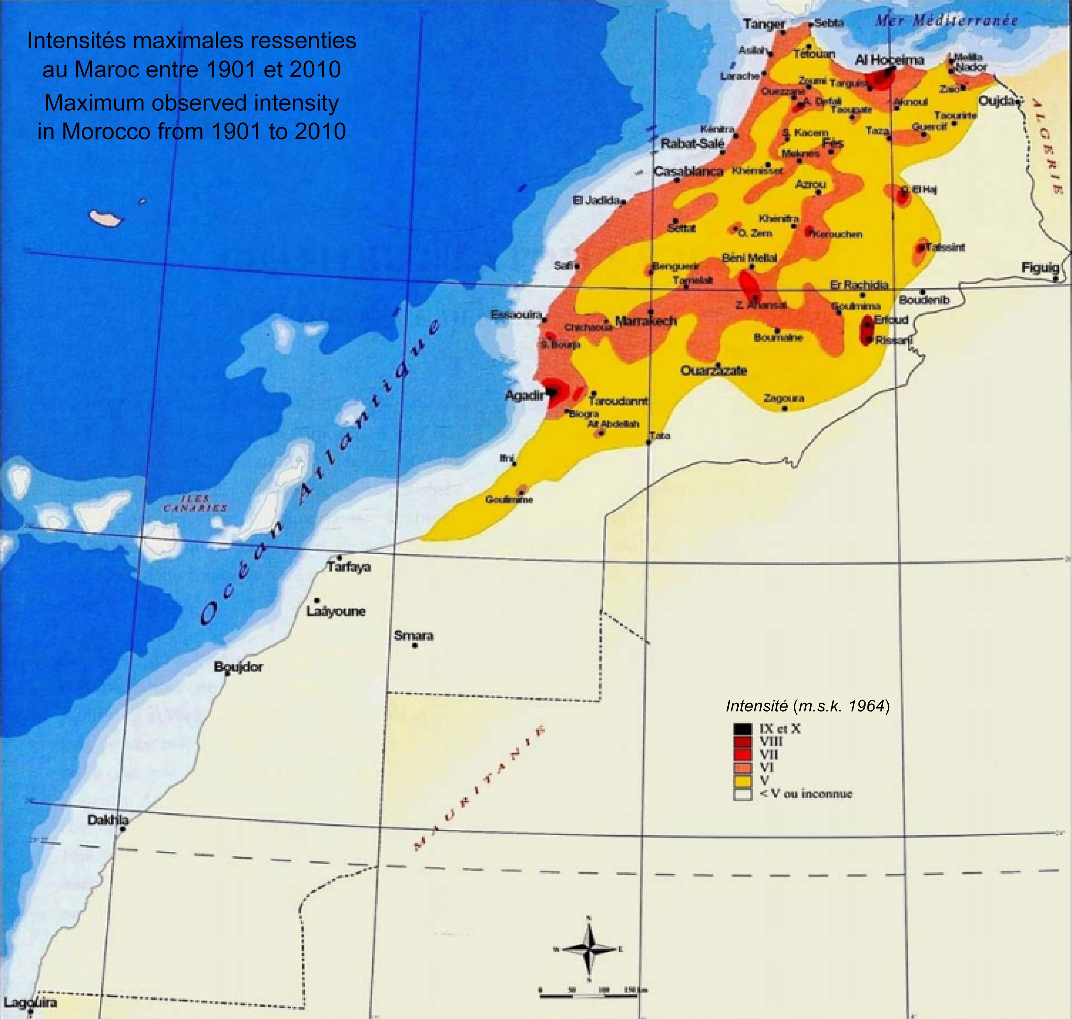
Figure 3.
The portrayal of seismic hazards across Morocco. It is depicted through various colors, each corresponding to distinct types of seismic hazards: Red indicates ground shaking (i.e., very high risk); Orange represents liquefaction (i.e., high risk); Yellow denotes the potential for tsunamis (i.e., yellow risk); and light yellow signifies the occurrence of seiches (i.e. low risk). The figure shows that all four types of seismic hazards are present in Morocco, but that ground shaking is the most widespread hazard. Ground shaking is a hazard in all parts of Morocco, but it is most severe in the Rif Mountains and the Atlas Mountains. Liquefaction is a hazard in areas where the soil is loose and waterlogged. This type of soil is common in coastal areas and along river valleys. Tsunamis are a hazard in coastal areas. Seiches are a hazard in lakes and reservoirs. The figure also shows the location of some of the most significant seismic hazards in Morocco. These include: The Rif Mountains; the Atlas Mountains; and the Alboran Sea. Source: Cherkaoui & El Hassani[52].
-
-
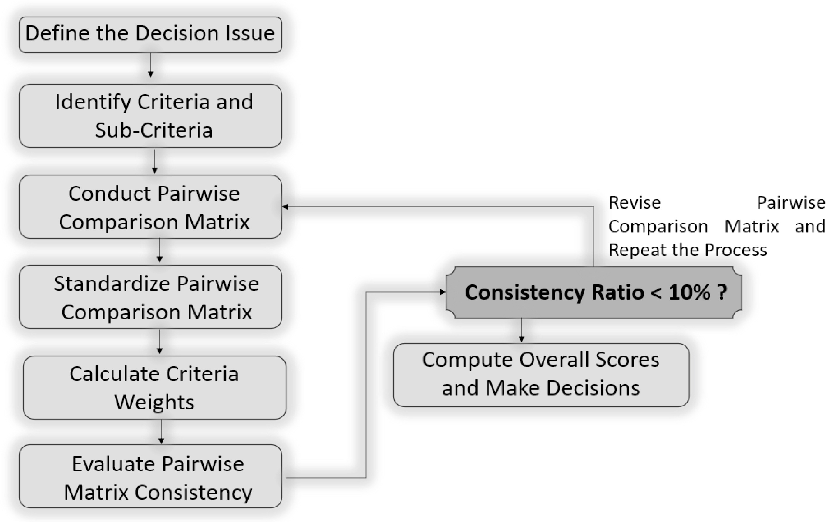
Figure 5.
Analytical Hierarchy Process (AHP) algorithm: a systematic method for evaluating and prioritizing earthquake management strategies using multiple criteria. Source: the author's own elaboration.
-
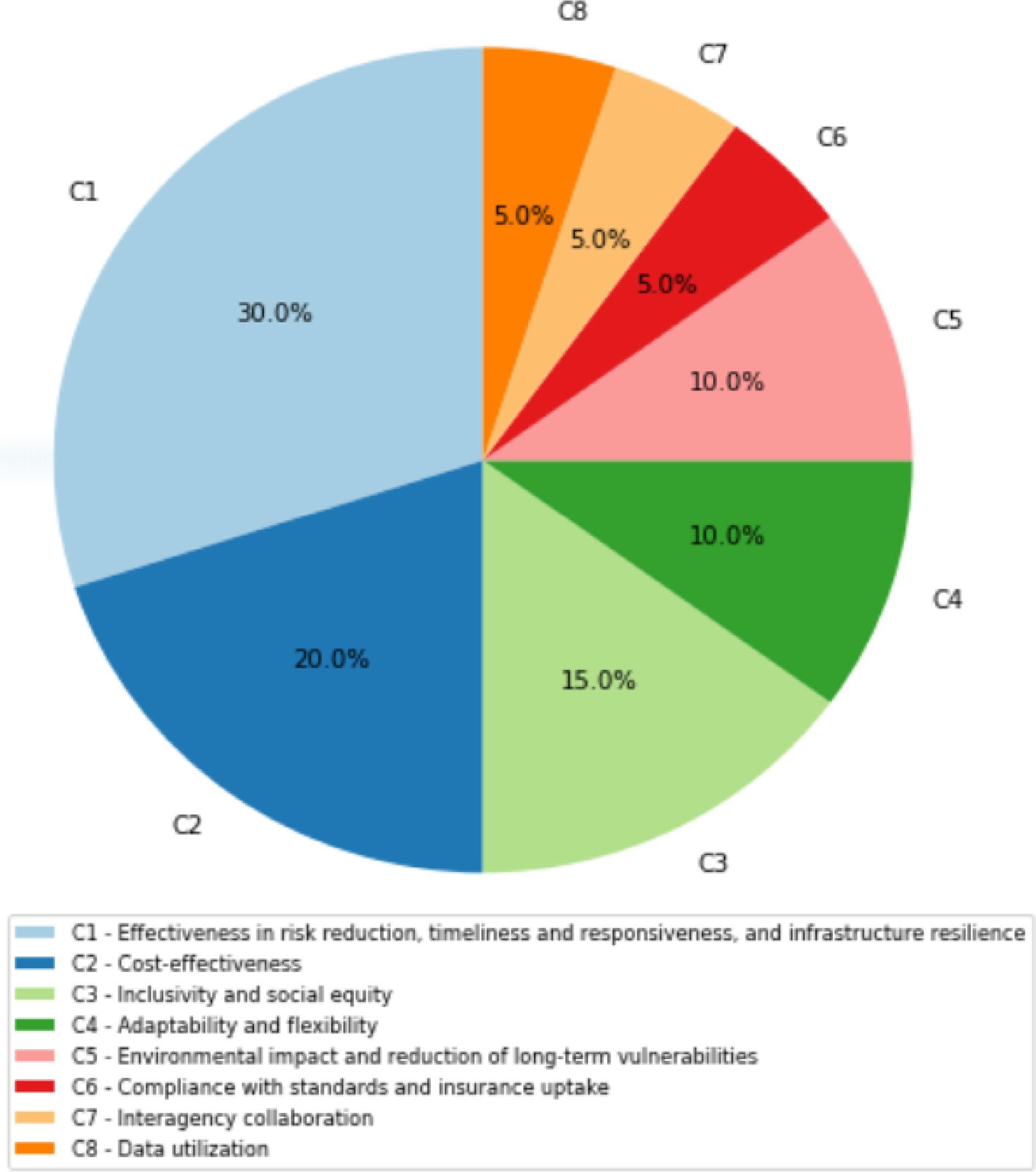
Figure 6.
Relative weights of criteria. Source: Own elaboration based on the methodology section.
-
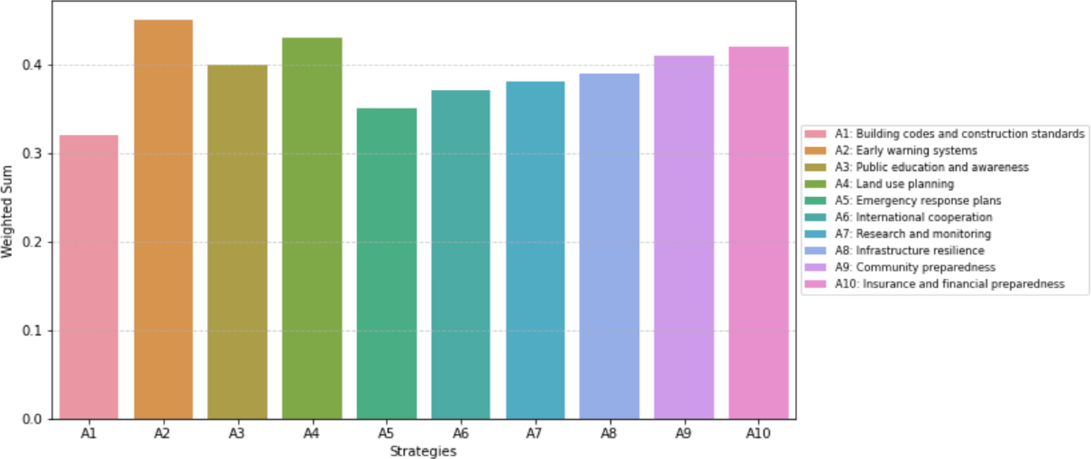
Figure 7.
Weighted sums of earthquake management strategies. Source: Own elaboration based on the methodology section.
-
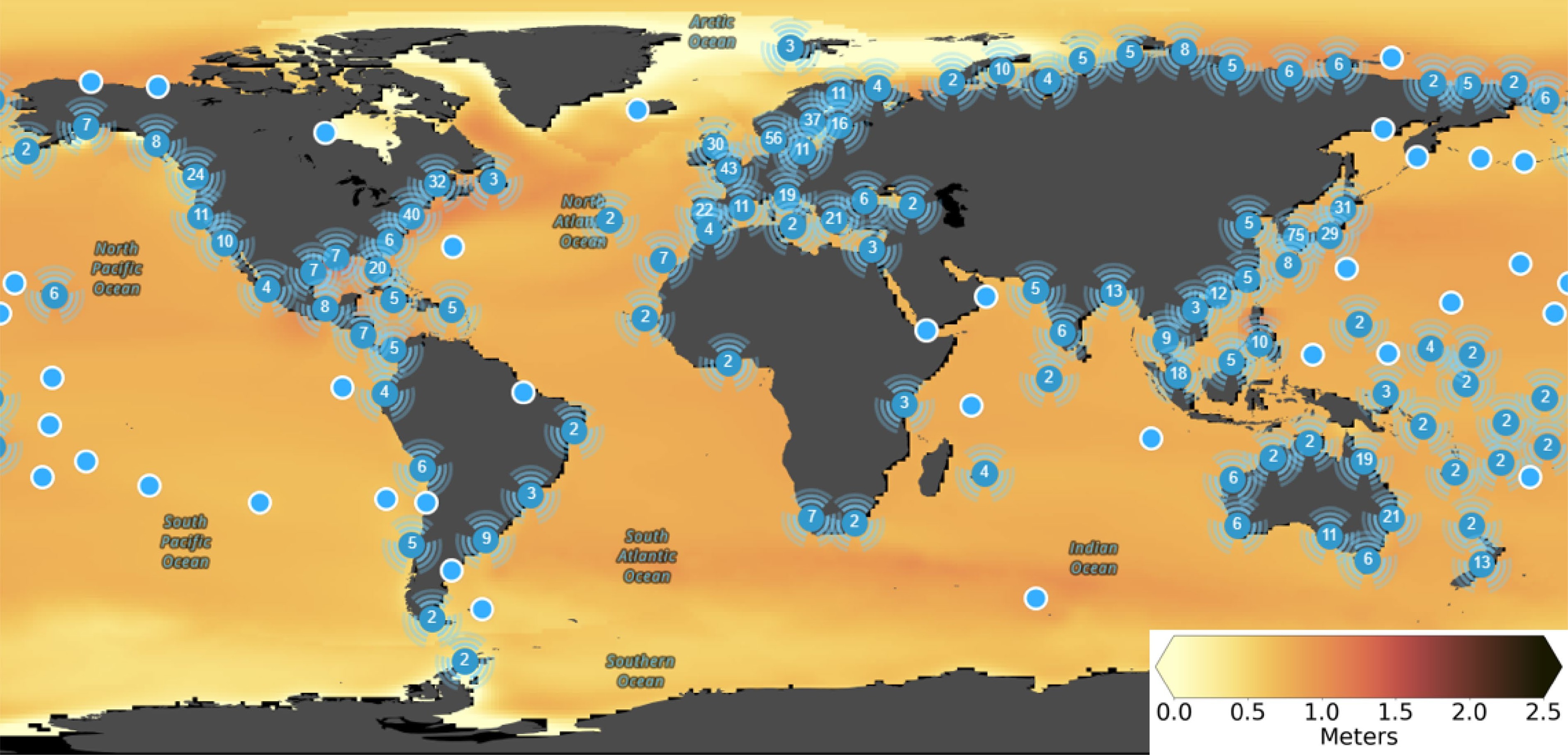
Figure 8.
Median projections of global and regional sea level rise, which is one of the direct impacts of climate change that can exacerbate earthquakes, by the year 2100 under a high-emission, low-mitigation Shared Socioeconomic Pathway (SSP5-8.5) scenario envisioning a future with limited global cooperation on climate change, leading to significant challenges in adaptation and a trajectory towards a warmer and more environmentally stressed world by the end of the 21st century[126]—relative to a 1995−2014 baseline. Sea level rise will not be evenly distributed around the world. The highest rates of sea level rise are projected to occur in Southeast Asia, the Pacific Islands, and the coastlines of North America and Europe. The highest rates of sea level rise are occurring in coastal areas. This is because the weight of the seawater can cause the land to subside, or sink. Sea level rise can make coastal areas more vulnerable to earthquakes, as the weight of the seawater can add additional stress to the Earth's crust, making it more likely to rupture. Source: The Intergovernmental Panel on Climate Change (IPCC) tool (the IPCC, which is a valuable resource for understanding the risks of sea level rise and developing adaptation strategies. It allows users to select different scenarios and time horizons to see how sea level rise is projected to impact different regions around the world[153].
-
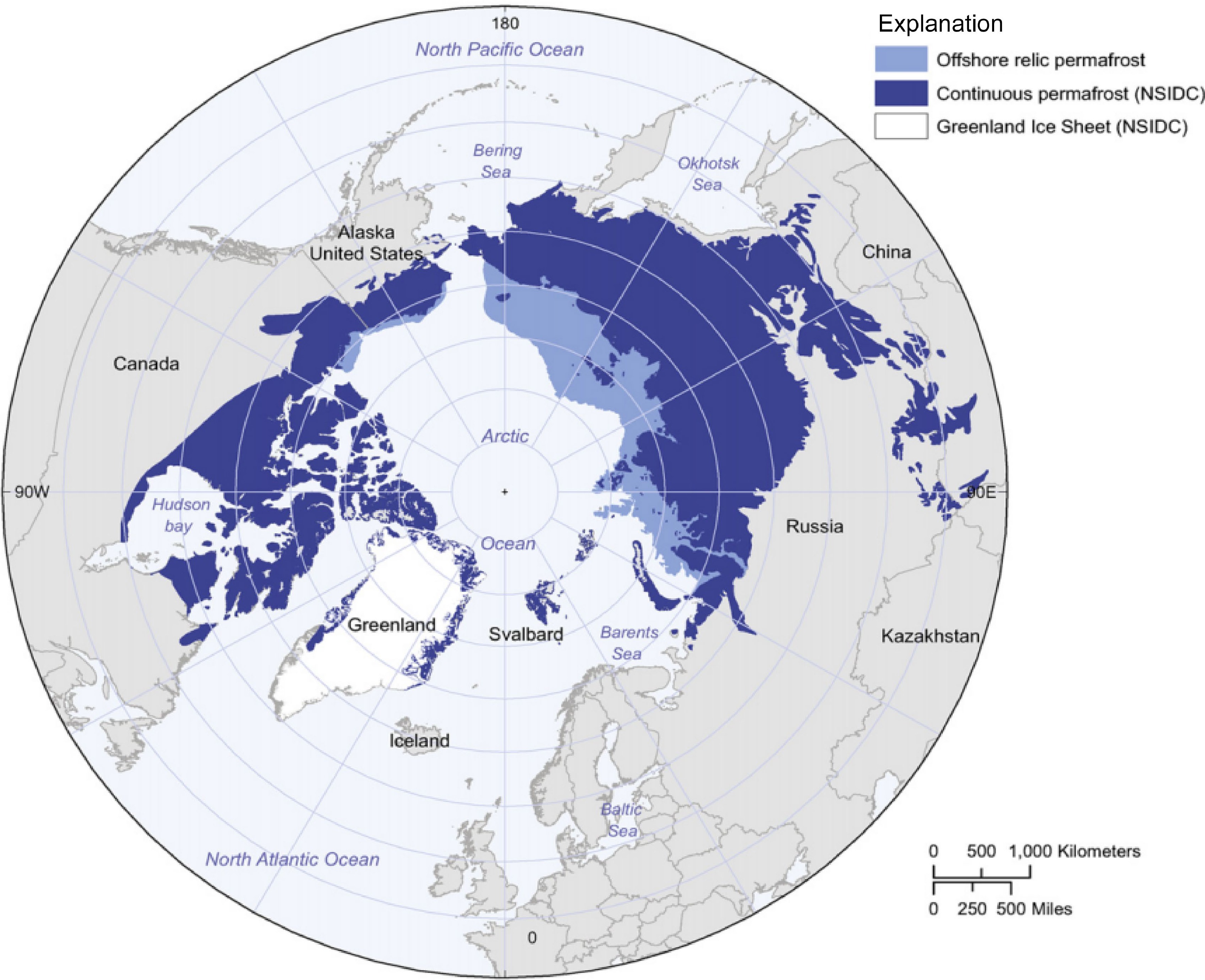
Figure 9.
The worldwide distribution of permafrost, which is another direct impact of climate change that can exacerbate earthquakes. The figure shows that permafrost is found in the Arctic and Antarctic, as well as in high-altitude regions such as the Himalayas and the Andes. Thawing permafrost can destabilize the ground, making it more likely to collapse and trigger landslides or mudflows. This could also make the ground more susceptible to shaking from earthquakes. Source: Collett et al.[154].
-
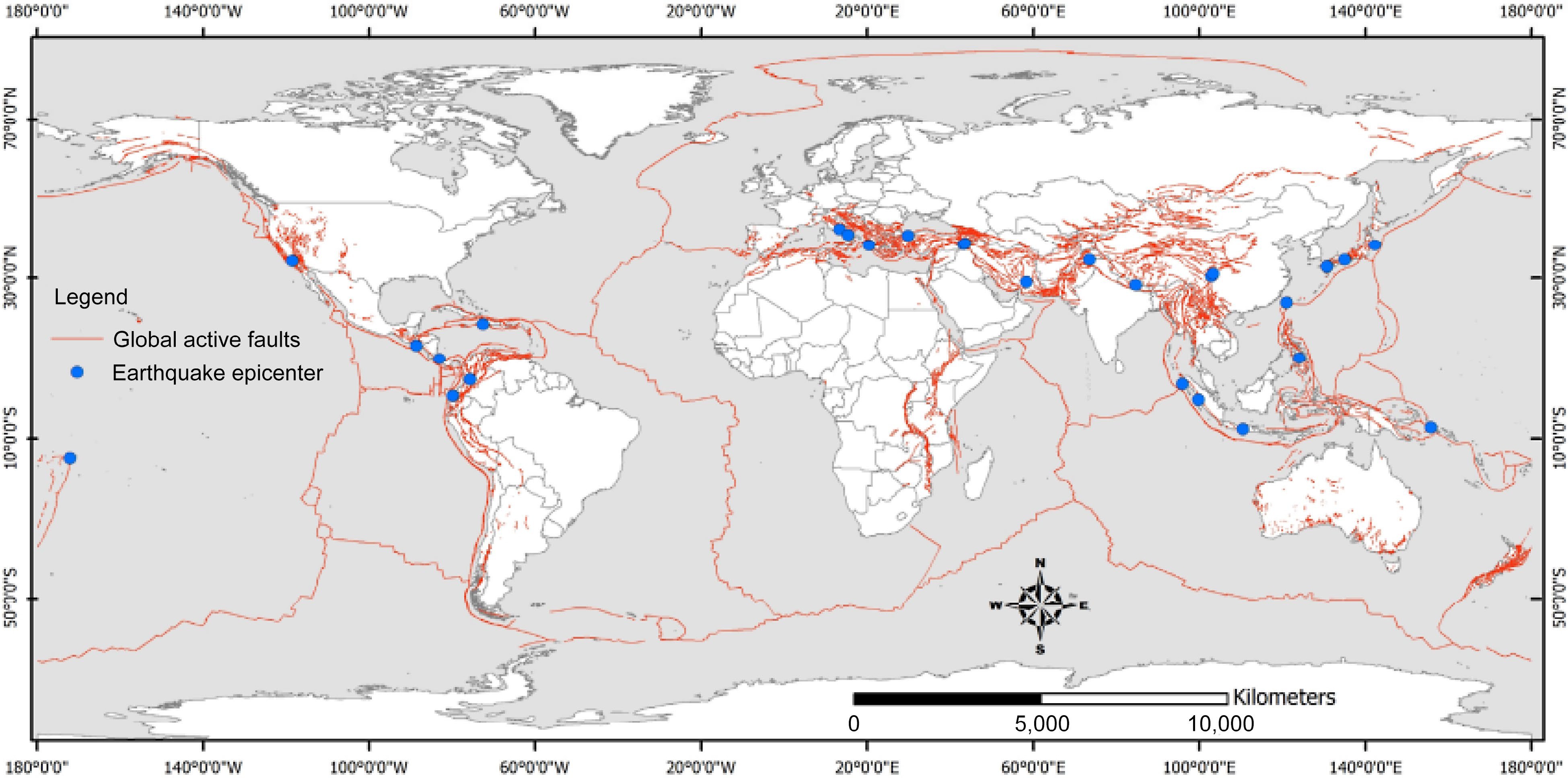
Figure 10.
Global active faults or the places where earthquakes are most likely to occur. Global active faults are a major source of earthquakes. When two plates of the Earth's crust move past each other, the friction can cause the rocks along the fault line to break and release energy, resulting in an earthquake. The size and magnitude of an earthquake depends on the length of the fault line that ruptures and the amount of energy released. This figure shows that the direct impacts of climate change on earthquakes are concentrated in the coastal areas (i.e., sea level rise and storm surge can inundate coastal areas, making them more vulnerable to earthquakes. This is because the weight of the seawater can add additional stress to the Earth's crust, making it more likely to rupture)[149,150], permafrost regions (i.e., thawing permafrost can destabilize the ground, making it more likely to collapse and trigger landslides or mudflows. This could also make the ground more susceptible to shaking from earthquakes)[151], and areas prone to droughts and floods (i.e., changes in precipitation patterns could lead to more droughts or floods. Droughts can dry out the soil, making it more brittle and more likely to crack. This can make the ground more susceptible to shaking from earthquakes. Floods can saturate the soil, making it heavier and more likely to cause landslides)[152]. The map also shows that earthquakes are most common in the Pacific Ring of Fire, which is a belt of seismic activity that surrounds the Pacific Ocean. The Pacific Ring of Fire is home to some of the world's most active volcanoes and earthquake faults. Other regions that are prone to earthquakes include the Mediterranean-Alpine belt, the East African Rift System, and the Himalayan-Tibetan region. Adapted from Mavrouli et al.[155].
-
C1 C2 C3 C4 C5 C6 C7 C8 C1 1 3 2 2 1 2 2 3 C2 1/3 1 2 2 3 1 1 1/3 C3 1/2 1/2 1 2 1/2 2 1 1/2 C4 1/2 1/2 2 1 2 1 2 1 C5 1 3 1/2 1/2 1 1/2 1/2 1 C6 1/2 1 1/2 1/2 2 1 1 1/2 C7 1/2 1/2 1 2 1/2 2 1 1/2 C8 1/3 3 1/2 1/2 1/3 1/2 1/2 1 Table 1.
Pairwise comparison matrix between criteria.
-
A1 A2 A3 A4 A5 A6 A7 A8 A9 A10 A1 1 2 1/2 1/2 1/2 1/2 1/2 1/2 1/2 1/2 A2 1/2 1 1/2 1/2 2 2 1/2 1/2 1/2 1/2 A3 2 2 1 1 1/2 1/2 1 1 1 1 A4 2 2 1 1 1 1/2 1 1 1 1 A5 2 1/2 1/2 1/2 1 1/2 1/2 1/2 1 1/2 A6 2 1/2 1/2 1/2 1/2 1 1/2 1/2 1 1/2 A7 1/2 1/2 1 1 1/2 1/2 1 1 1 1 A8 1/2 1/2 1 1 1/2 1/2 1 1 1 1 A9 1/2 1/2 1 1 1/2 1/2 1 1 1 1 A10 1/2 1/2 1 1 1/2 1/2 1 1 1 1 Table 2.
Pairwise comparison matrix between alternatives.
Figures
(10)
Tables
(2)