-
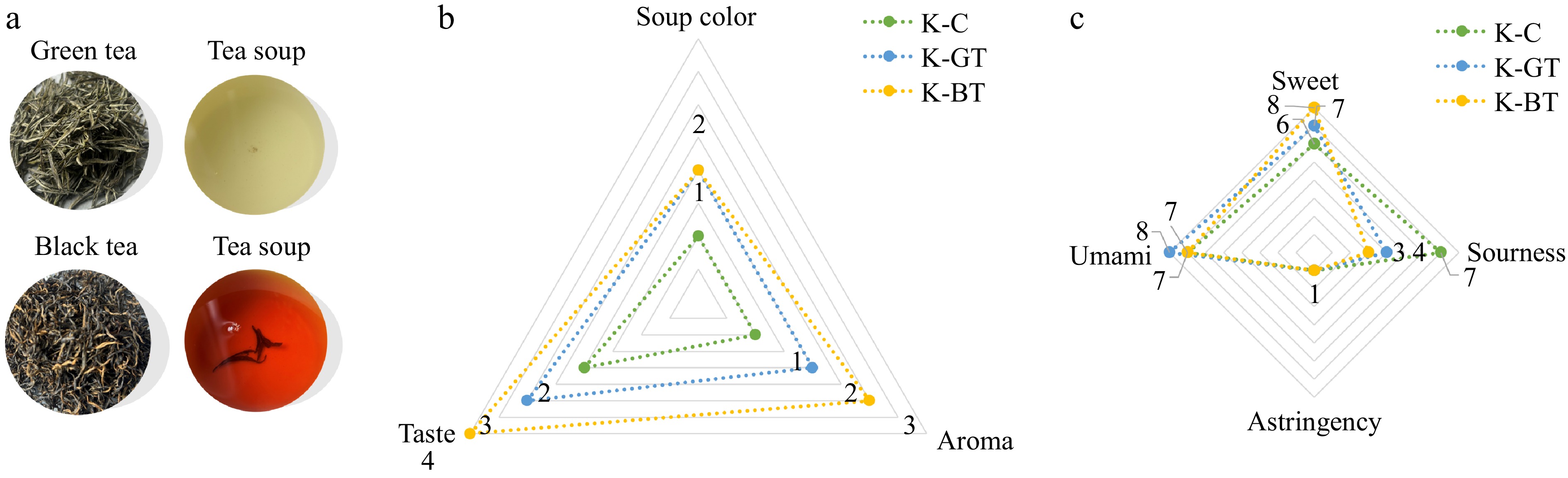
Figure 1.
Sensory evaluation results of Kombucha. (a) The appearance of dried tea, tea infusion according to sensory analysis. (b) The effects of three type of Kombucha on the taste, aroma, and soup color according to sensory analysis. (c) Taste evaluation of three type of Kombucha.
-
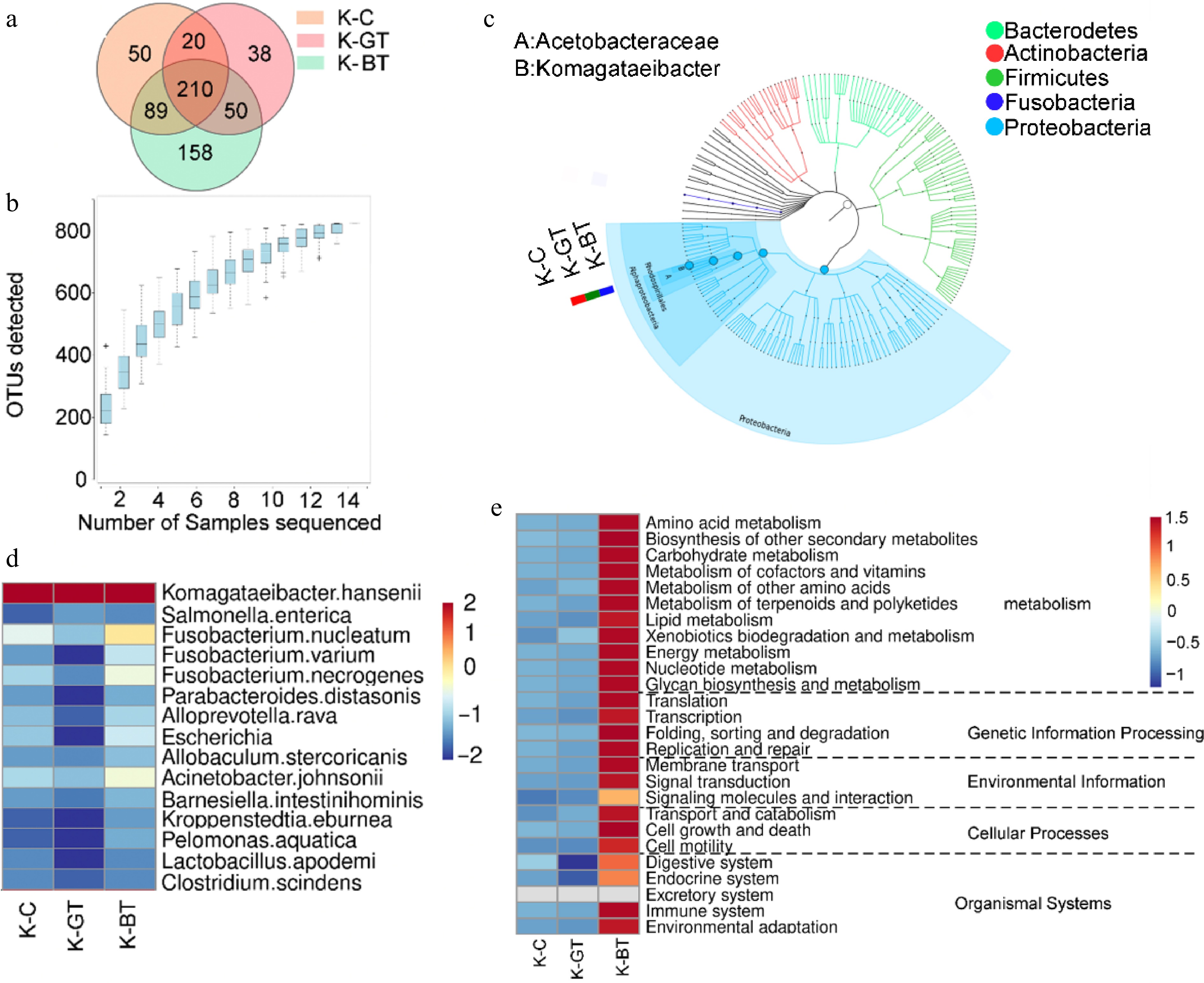
Figure 2.
16S sequencing analysis of Kombucha fermentation liquor among different groups. (a) Venn diagram of 16S sequencing OTUs. (b) Species accumulation curve. (c) Graphlan diagram. (d) Heat map displaying distribution of species at the bacterial species level. (e) Relative abundance of major metabolic pathways from the KEGG database (based on 16S rRNA sequencing data). To ensure data comparability and accuracy, functional gene abundances have been log10 transformed and normalized using z-score standardization (zero-mean normalization).
-
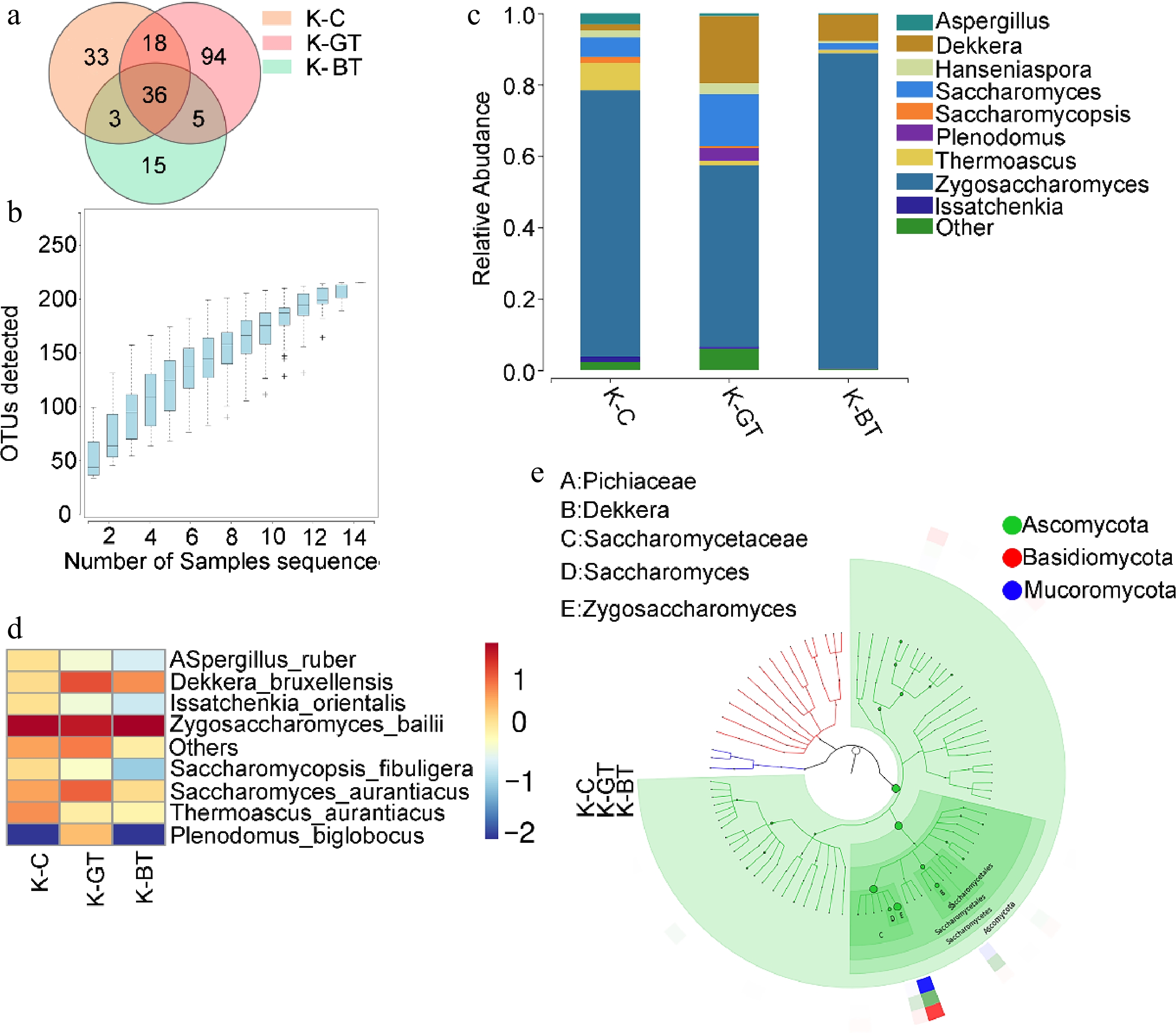
Figure 3.
Analysis of ITS sequencing of Kombucha fermentation fungi. (a) Venn diagram of ITS sequencing OTUs. (b) Species accumulation curve. (c) Bar chart of fungal genus-level species distribution. (d) Heat map of fungal species-level species distribution. (e) Graphlan diagram.
-
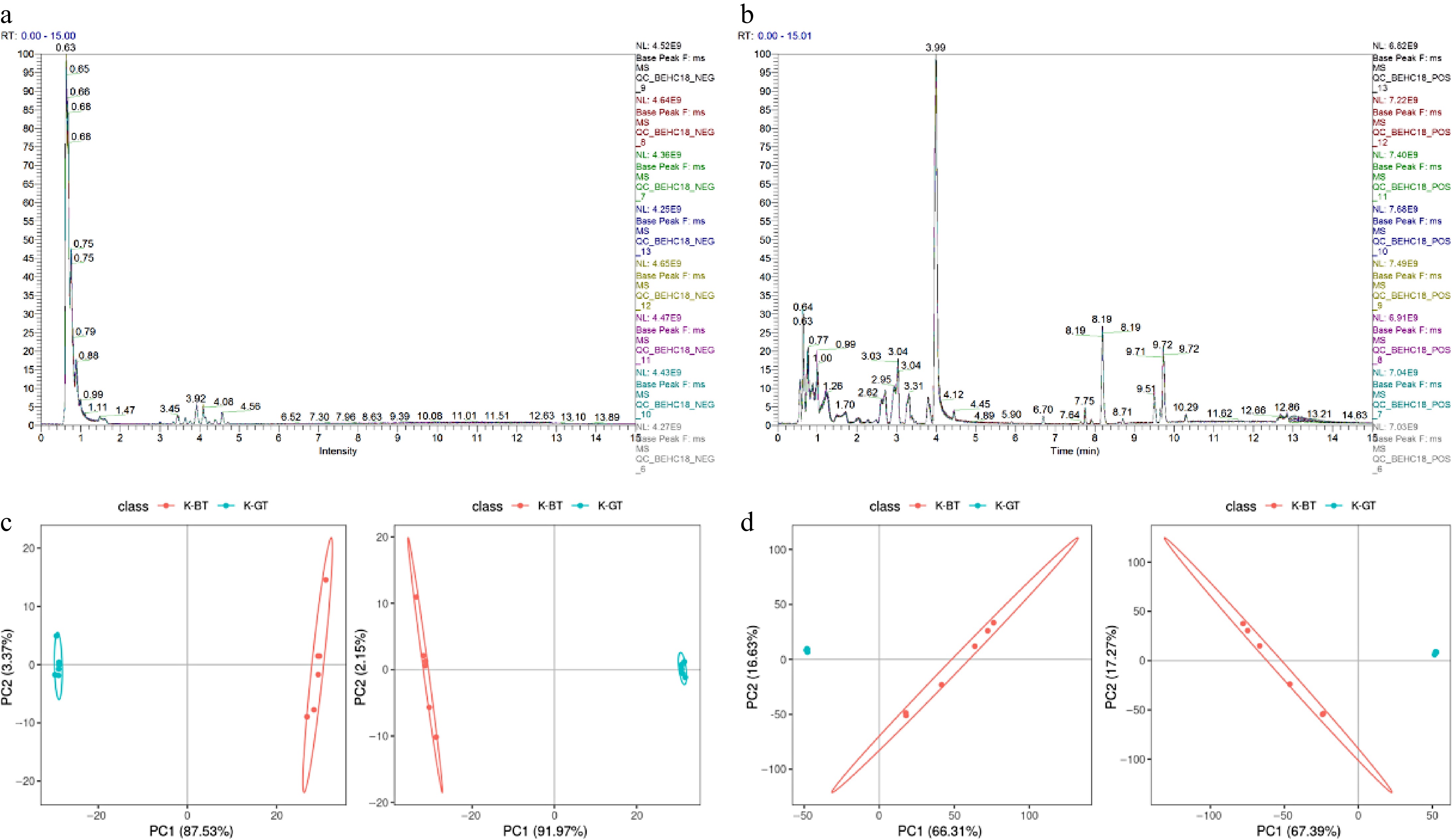
Figure 4.
Non-targeted metabolomic data analysis of different types of Kombucha. (a), (b) Overlay of base peak chromatograms (BPCs) in negative and positive ion modes for QC samples. (c), (d) PCA and PLS-DA score plots depicting the analysis models between K-GT and K-BT groups.
-
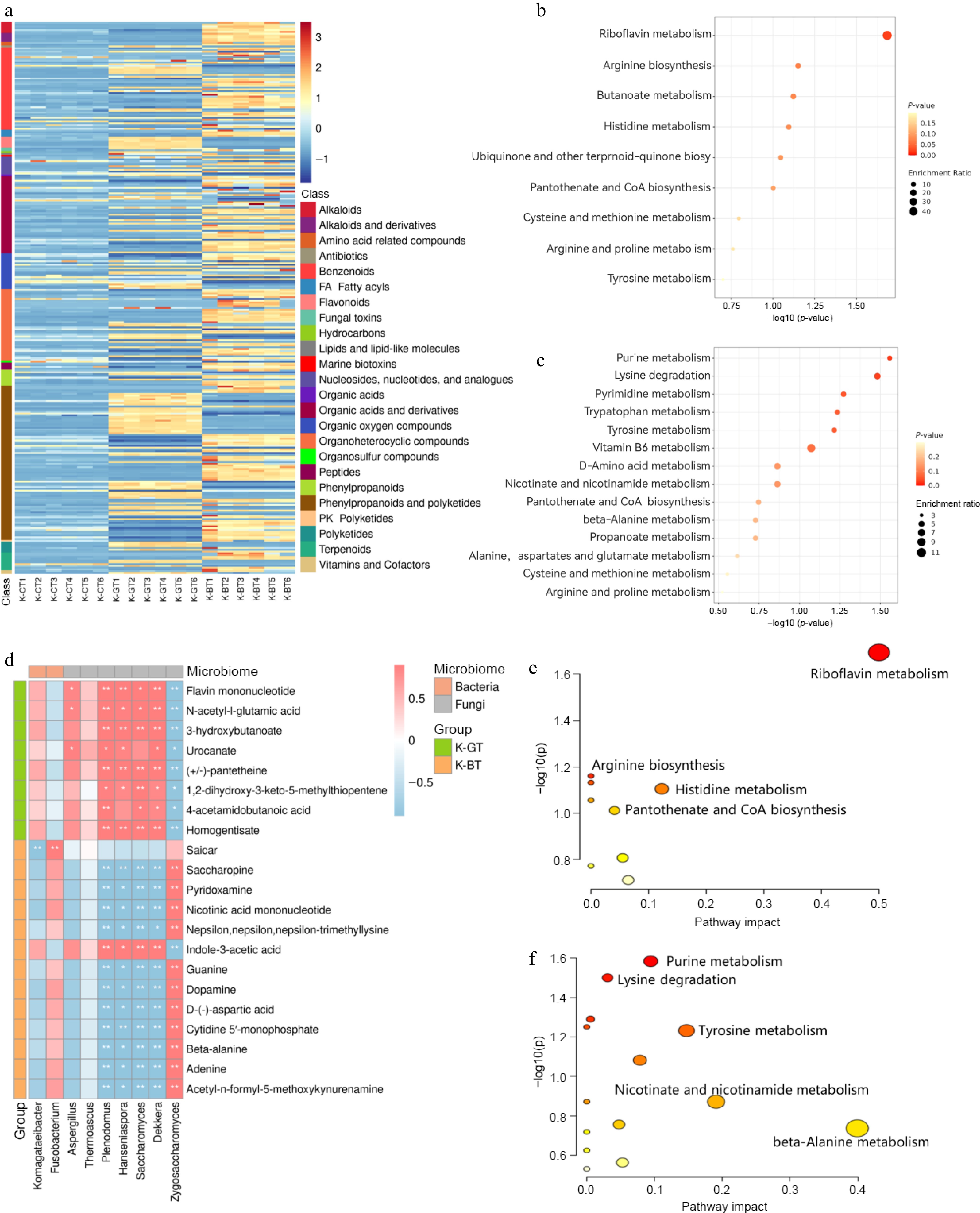
Figure 5.
Differential metabolite analysis of K-GT and K-BT fermentation liquids. (a) Heatmap of differential metabolites. (b) KEGG enrichment analysis of differential metabolites in K-GT. (c) KEGG enrichment analysis of differential metabolites in K-BT. (d) Correlation analysis between key metabolites and microorganisms in K-GT and K-BT. The top 10 key metabolites enriched in KEGG from the differential metabolites of K-GT and K-BT were analyzed for Pearson correlation with bacterial and fungal species. The x-axis represents bacterial and fungal genera, and the y-axis represents key metabolites. Red and blue indicate positive and negative Pearson correlation coefficients (r), respectively. * and ** denote significance levels of 0.01 < p < 0.05 and 0.001 < p < 0.01, respectively. (e), (f) Cluster analysis scatter plots of metabolites obtained from the correlation analysis in the K-GT and K-BT groups, respectively.
-
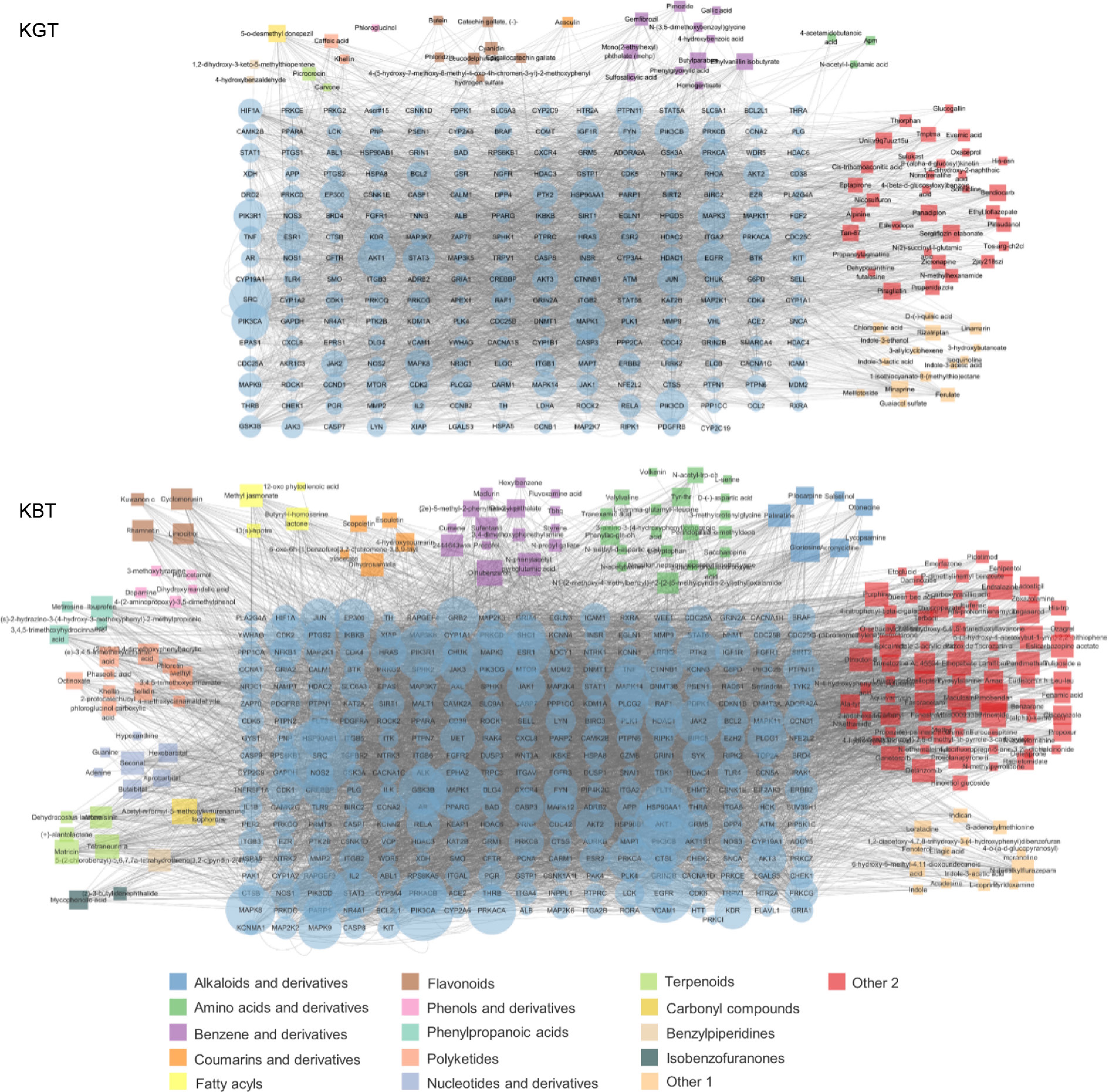
Figure 6.
Key bioactive components, key target genes, and PPI network diagrams for (a) K-GT, and (b) K-BT. Note: Circles represent target genes, with their size and color intensity indicating the degree of connectivity to active components and their importance in the network. Squares represent active components, with their size proportional to the number of connected target genes. The network topology analysis based on connectivity determined the core bioactive components and key target genes for K-GT and K-BT.
Figures
(6)
Tables
(0)