-
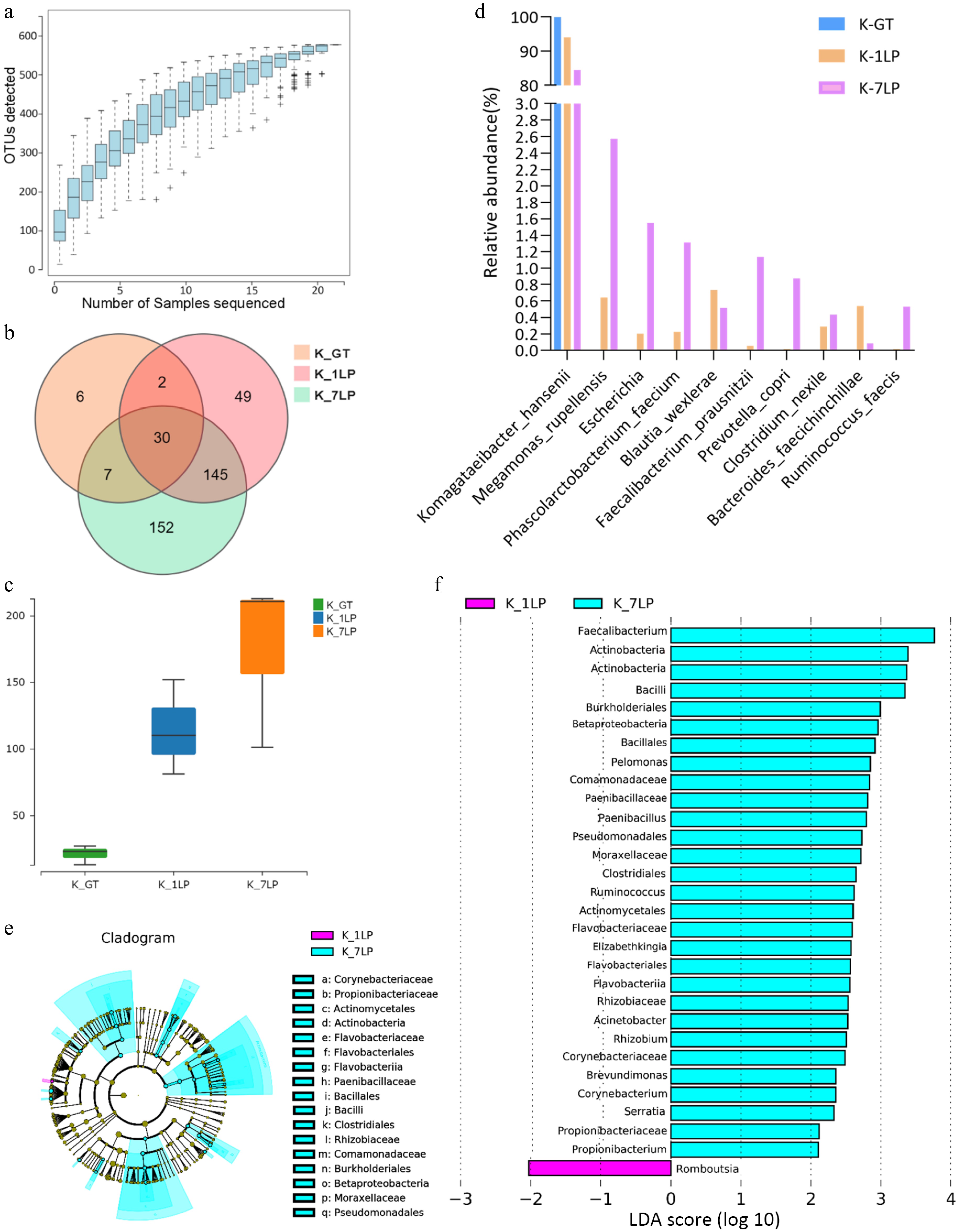
Figure 1.
Statistical analysis of 16S sequencing data for three kinds of kombucha. (a) Species rarefaction curve; (b) Venn diagram of bacterial OTUs; (c) Boxplot of α-diversity (sobs index). The Kruskal Test test is used to show differences in alpha diversity between groups. The five lines from bottom to top are: minimum, first quartile, median, third quartile, and maximum; (d) Histogram of relative abundance of three kinds of kombucha key bacteria; (e) Evolutionary branch diagram. Different colors indicate different groups, and nodes in different colors indicate microbiomes that play an important role in the group represented by the color. A color circle represents a biomarker, and the legend in the upper right corner is the biomarker name. The yellow nodes represent microbial groups that do not play an important role in the different groups. From the inside to the outside, each circle in turn is phyla, class, order, family, genus level species; (f) LDA value distribution histogram. Different colors represent different groups of microorganisms that have a significant role. It mainly shows the significantly different species whose LDA score is greater than the preset value, namely the Biomaker with statistical difference, the default preset value is 2.0 (only the absolute value of the LDA value greater than 2 are shown in the figure). The colors of the bar chart represent the respective groups, and the length represents the LDA score, which is the size of the impact of significantly different species between the groups.
-
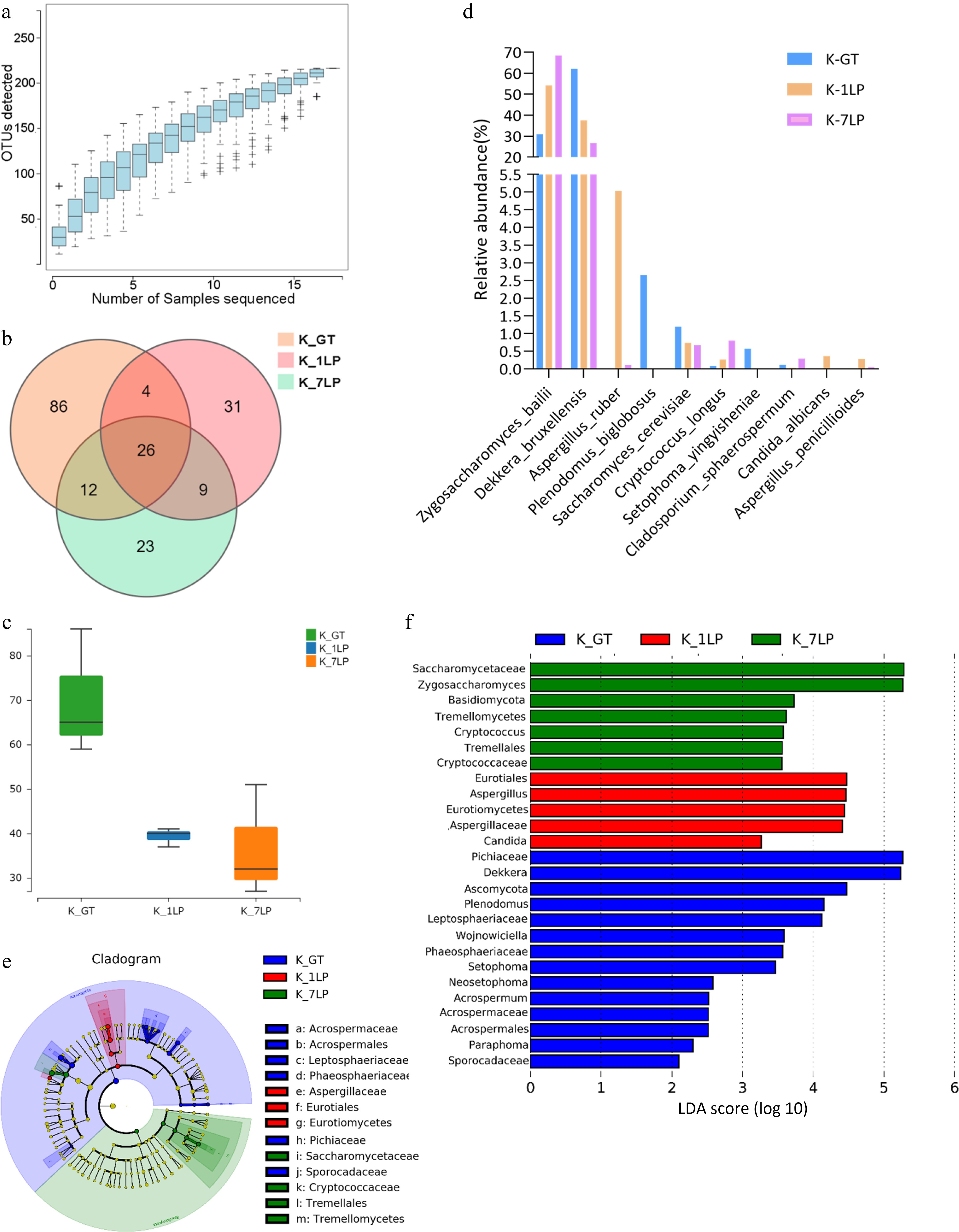
Figure 2.
Statistical analysis of ITS sequencing data for the three groups of kombucha beverages. (a) Fungal rarefaction curve; (b) Venn diagram of fungal OTUs; (c) Boxplot of α-diversity (sobs index). The Kruskal test is used to show differences in alpha diversity between groups. The five lines from bottom to top are: minimum, first quartile, median, third quartile, and maximum; (d) Histogram of relative abundance of three kinds of kombucha key fungal differences; (e) Evolutionary branch diagram. Different colors indicate different groups, and nodes in different colors indicate microbiomes that play an important role in the group represented by the color. A color circle represents a biomarker, and the legend in the upper right corner is the biomarker name. The yellow nodes represent microbial groups that do not play an important role in the different groups. From the inside to the outside, each circle in turn is phyla, class, order, family, genus level species; (f) LDA value distribution histogram. Different colors represent different groups of microorganisms that have a significant role. It mainly shows the significantly different species whose LDA score is greater than the preset value, namely the Biomaker with statistical difference, the default preset value is 2.0 (only the absolute value of the LDA value greater than 2 are displayed in the figure). The colors of the bar chart represent the respective groups, and the length represents the LDA score, which is the size of the impact of significantly different species between the groups.
-
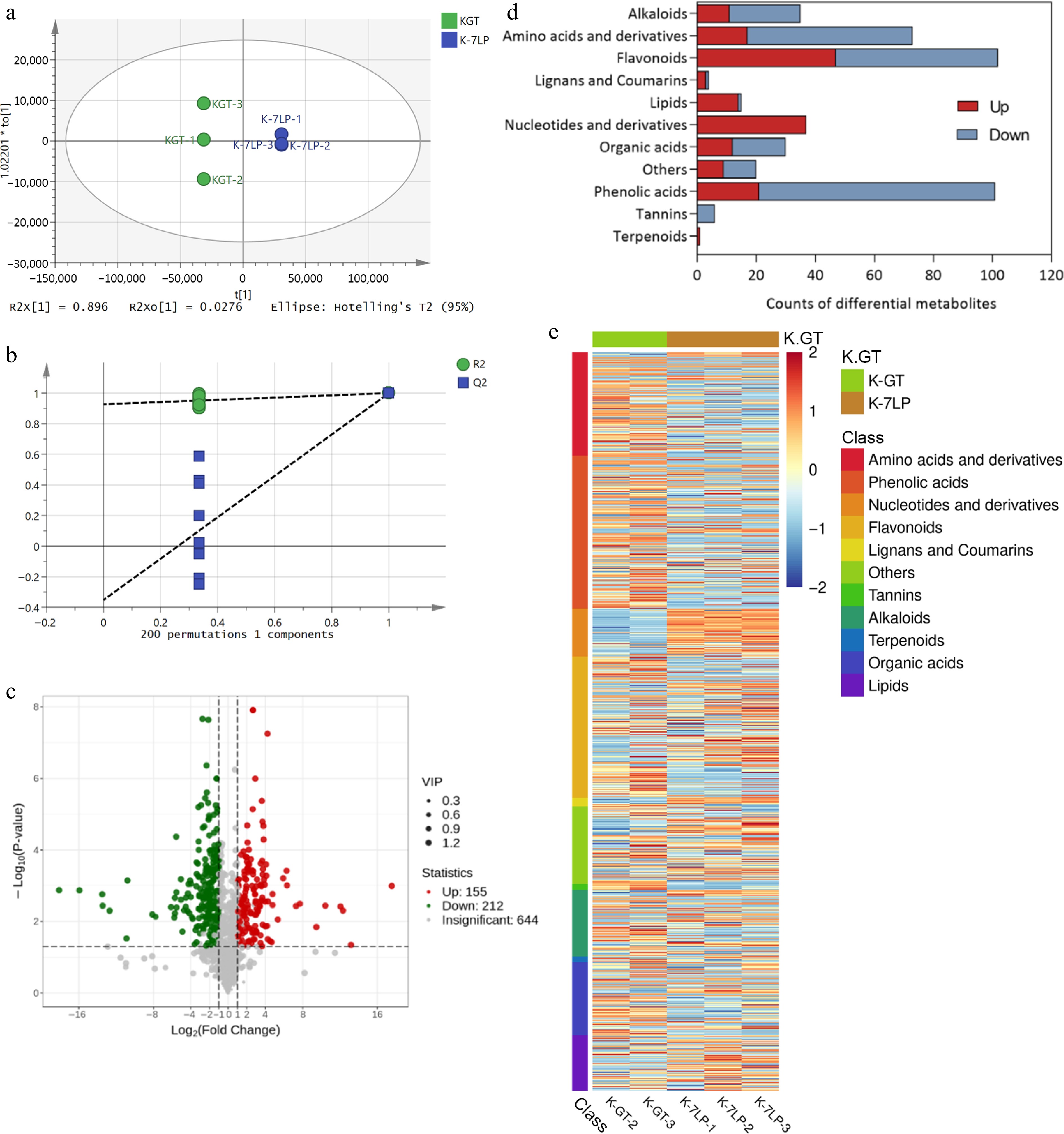
Figure 3.
Analysis of differential metabolites in K-GT and K-7LP. (a) OPLS-DA analysis; (b)Permutations plot for OPLS-DA model; (c) Volcano plot of differential metabolites; (d) Bar plot of differential metabolite classification; (e) Heatmap of differential metabolite abundance clustering.
-
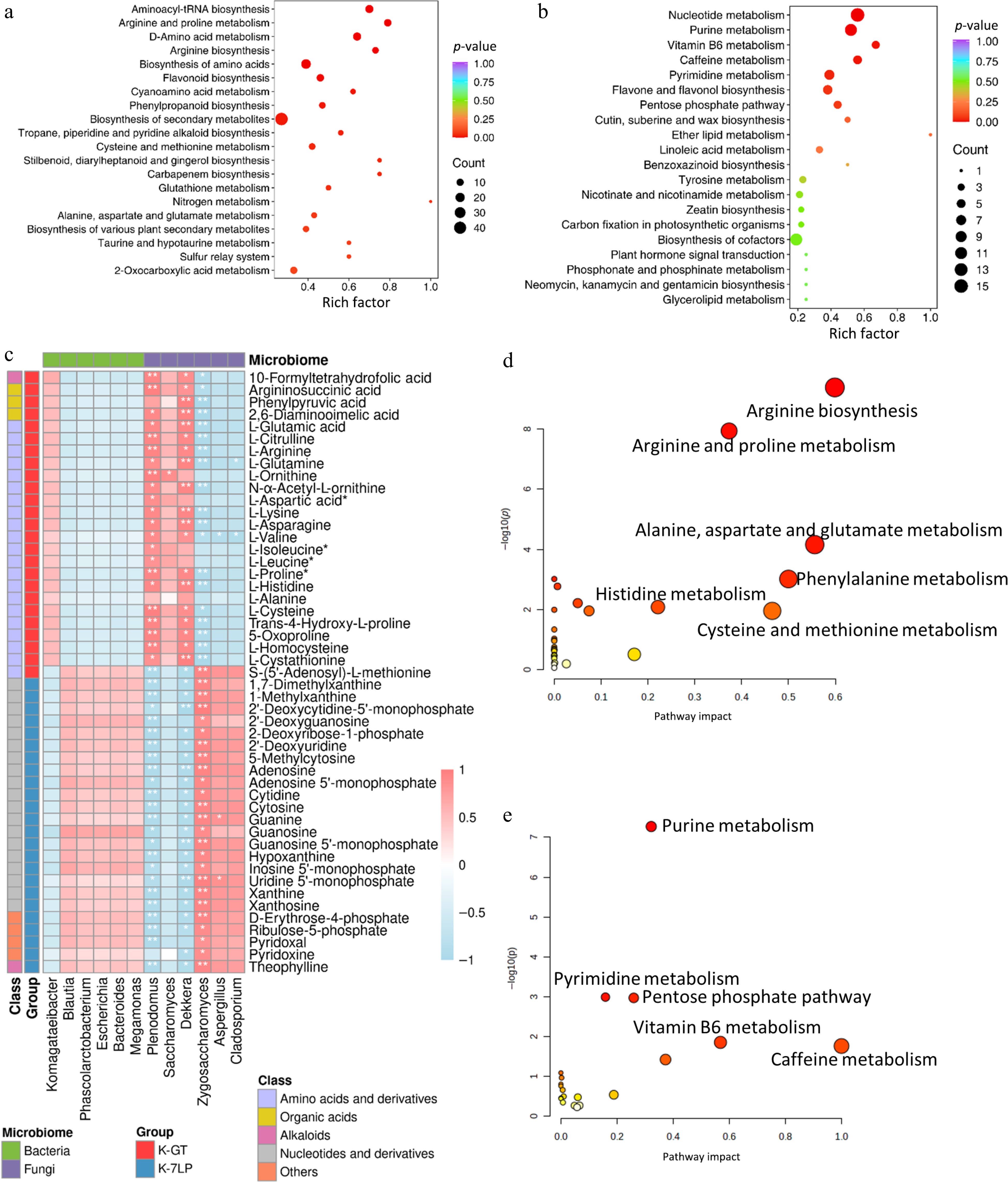
Figure 4.
KEGG enrichment analysis of differential metabolites in two types of kombucha. (a) KEGG enrichment analysis for differential metabolites in K-GT. (b) KEGG enrichment analysis for differential metabolites in K-7LP. Each bubble depicted in the graph represents a metabolic pathway; larger bubbles indicate a higher concentration of metabolites; the color of the bubble corresponds to the p-value in the enrichment analysis, with darker colors indicating a higher degree of enrichment. (c) Correlation analysis between key pathway active components and microbes: Pearson correlation analysis was conducted between 12 bacterial and fungal genera and 49 metabolites differentially enriched across 10 KEGG pathways. The horizontal axis represents the bacterial and fungal genera, while the vertical axis represents the 49 differentially enriched metabolites from these pathways. The colors red and blue indicate the Pearson correlation coefficient (r), with * and ** denoting significance levels of 0.01 < p < 0.05 and 0.001 < p < 0.01, respectively. (d) and (e) respectively show the scatter plots of clustering analysis of differential bioactive components for K-GT and K-7LP. In these plots, the X-axis represents the pathway impact, the Y-axis represents −log(p) value, the size of the circles represents the gene number, and the color represents the p-value, with darker colors indicating smaller p-values.
-
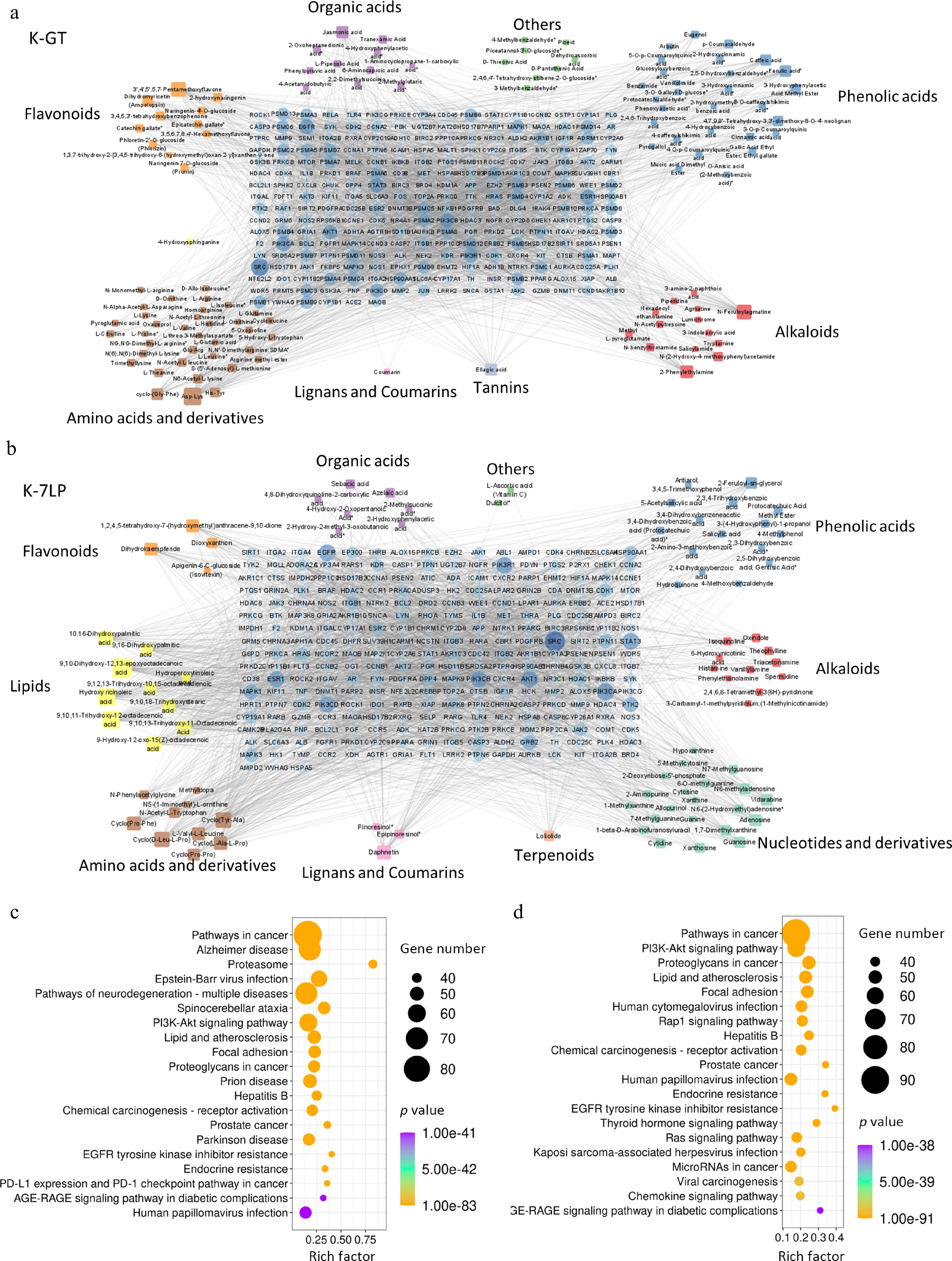
Figure 5.
Key bioactive components, key target genes, and PPI network diagrams for (a) K-GT, and (b) K-7LP. In the PPI network diagrams, circles represent target genes, with their size and color intensity indicating the degree of connectivity to active components and their importance in the network. Squares represent active components, with their size and color depth proportional to the number of connected target genes. The network topology analysis based on connectivity determined the core bioactive components and key target genes for K-GT and K-7LP. (c) and (d) respectively show the KEGG enrichment analysis scatter plots of target genes affected by differential bioactive components for K-GT and K-7LP. In these plots, the X-axis represents the rich factor, the Y-axis represents the pathway names, the size of the circles represents the gene number, and the color represents the p-value, with darker colors indicating smaller p-values.
Figures
(5)
Tables
(0)