


-
The time-space (TS) traffic diagram is an important tool for visualizing and analyzing traffic flow[1−3]. It serves to represent traffic conditions under various circumstances, with time and space as the primary axes. Researchers utilized TS traffic diagrams to identify traffic bottlenecks and assess the extent of delays in bottleneck sections[4]. This contributes to understanding the operational characteristics of highways and facilitates the formulation of policies and measures aimed at alleviating traffic congestion[5], addressing bottleneck issues, improving travel comfort, and enhancing the overall travel experience[6,7]. The TS diagram also enhanced its functionality in comprehensive traffic analysis by contributing to the estimation of travel times[8−10] and the identification of constant vehicle speeds[11]. The TS diagram also played a role in developing time-space unit models for estimating carbon dioxide emissions from highways[12,13], thereby enriching its applications in various fields.
Initially, the TS traffic diagram was directly represented on a map and colored based on instantaneous speed[14]. However, due to the discrete distribution of trajectory points, visualizing the direct evolution process of traffic posed challenges. Consequently, some researchers introduced mosaic graphics to depict the changes in average speed. Each mosaic represented the average speed of vehicle trajectory points for a certain section during a specific period[15]. Some studies also provided new insights into the hysteresis phenomenon and introduced a figure-eight hysteresis pattern[16,17]. Laval employed the parallelogram method to characterize the hysteresis phenomenon in the driving process, which is often associated with driver behavior[16]. These findings employed a convolutional neural network capable of accurately predicting average traffic speed[18]. Through continuous research, the TS diagram evolved from simply coloring individual trajectory points to the utilization of rectangular cells that covered the coordinate system. These cells were then filled with gradient colors based on the average speed of all trajectory points within each cell[19]. This improvement allows the TS diagram to achieve an aggregated dynamic visualization of traffic flow, overcoming the limitations of discrete trajectory points.
Trajectory data serves as the important data foundation for constructing TS traffic diagrams. Typically, the data required for generating TS traffic diagrams are collected by road detectors at various time intervals[20]. The traffic data obtained from detectors offered insights into the traffic conditions on highways[21−23] and served as valuable information for estimating the traffic state[24,25]. Because of variations in transportation investments across different regions, the deployment density of road detectors cannot achieve an optimal state and typically ranges from several hundred to several thousand kilometers[26]. Simultaneously, the upload frequency of floating car data is set between one minute and several minutes[3]. Under these conditions, the collected data exhibits certain dispersed characteristics. Due to the discrete nature of trajectory data[26], achieving visualization effects in the past often required the use of external tools such as GIS for map processing[27], presenting certain challenges[6]. Alternatively, new fundamental diagram construction methods were proposed based on detector pass rates[28]. Jiang et al. conducted multidimensional analyses of spatiotemporal patterns in the data using circular pixel graphs, spatiotemporal stacked graphs, and nested pixel bars[29]. Wang et al. mapped processed data to road networks and visualized traffic conditions from a propagation perspective[30,31]. They employed a straightforward mapping method to match detection data with TS traffic diagrams for understanding traffic congestion situations[32]. In summary, the construction of TS diagrams relies heavily on trajectory data collected by road detectors. However, the discrete nature of this data often presents visualization challenges, leading to the development of various methods aimed at enhancing the effectiveness of traffic diagram visualization.
According to Edie's general definition, average traffic variables can accurately represent fundamental traffic conditions only when homogeneous traffic states are maintained within the cells[33]. This means that traffic variables are stable and reliable when the traffic within each cell is uniform. However, due to the inherent shape characteristics of rectangular cells, trajectory points falling within them cannot fully encompass the start-stop driving behaviors of vehicles, resulting in variations in traffic states between adjacent cells. As research progresses, the researcher proposed constructing parallelogram cells with the reverse congestion wave propagation rate as the slope[1]. The trajectory data contained within these cells are more likely to encompass the complete process of acceleration and deceleration states. Even if the complete acceleration and deceleration processes cannot be entirely contained due to the limitations of cell size, adjacent cell units capture more similar vehicle operating conditions. This facilitates the capture of similar traffic waves, resulting in enhanced stability when constructing TS traffic diagrams and improving the visual representation of congestion processes. The reverse traffic wave propagation rate typically ranges from −10 to −20 km/h[34]. Selecting the reverse traffic wave propagation rate as the slope for drawing pTS diagrams plays a crucial role in visualizing traffic states and identifying typical traffic patterns.
Due to data accuracy limitations and established algorithms, an immediate overhaul of the traditional TS diagram construction methods that are widely embedded in various systems is not practical. However, there is a growing need to enhance the visual representation of existing rTS diagrams to better reflect real-world traffic conditions. Building upon the findings of He, which demonstrate the superior portrayal of traffic flow using pTS diagrams compared to rTS diagrams[1], we introduce a novel approach based on the area-weighted transformation that directly converts rTS diagrams into pTS diagrams. This innovative method streamlines the conversion process, eliminating the need for additional data filling during pTS diagram creation. We anticipate that this method will significantly expedite the transition from basic rTS diagrams to more advanced pTS diagrams in the field of traffic space-time mapping.
The remainder of the paper is organized as follows. The next section introduces the generation of TS diagrams and the TS diagram transformation method based on area-weighted. We then present the method of indicator validation and the transformed TS diagrams, followed by an elaboration on the obtained results.
-
The rTS diagram divides a two-dimensional plane into equally sized rectangular cells, with time on the horizontal axis and road segment length on the vertical axis. These cells are filled with the average speed of trajectory points, providing an intuitive display of traffic flow at different time intervals and road segments. The rTS diagram is the prevailing representation in research, summarizing dispersed traffic trajectory points into overall average velocities, establishing fixed local clusters, and illustrating fluctuations in traffic flow. However, vehicles often adjust their speed based on the preceding vehicle's status, leading to stop-and-go scenarios[14]. When such scenarios occur within rectangular cells, significant disparities between adjacent cells emerge, failing to meet the criteria for a uniform representation of traffic waves. On the other hand, if these scenarios are depicted within parallelogram cells with the traffic wave propagation speed determining the slope, the resulting traffic states in adjacent cells become more similar. The utilization of pTS diagrams to represent vehicle trajectory states, validated using travel time as an indicator, revealed an enhancement in accuracy[1], particularly when handling congested traffic, ultimately leading to more compelling visual outcomes.
Determining boundaries
-
Traffic flow can be categorized into two states: free-flow and congestion. In the rTS diagram, if traffic states can be clearly distinguished, the transformation can generate a pTS diagram depicting free-flow and congestion. To create the free-congestion flow pTS diagram, we employ a region-growing algorithm to segment the rTS diagram and identify regions with distinct free-flow and congestion characteristics. Initially, a seed point is established at the starting position of a rectangular cell, and other cells are subsequently examined to determine if they should be merged into the same region, based on the average speed value of cell units as a similarity criterion. Cells identified as similar are assigned a value of 0, while the others receive a value of 1, resulting in the creation of a binary matrix with the same number of rows and columns as the rectangular cells. Subsequently, the sum of each column in the binary matrix is calculated, and columns with values less than one-third of the total sum are identified. These identified columns determine the column division lines, representing the boundary between free-flow and congestion. Taking into account the propagation direction of congestion, parallelogram cells are used to depict the congestion section. If congestion is uniformly distributed without clear boundaries within the original rTS diagram, the entire rTS diagram is transformed into a unified pTS diagram.
Determining the average speed of cells
-
To create a pTS diagram based on a given rTS diagram, the rTS diagram serves as the foundational map for the drawing process. By knowing the dimensions of the rTS diagram, we can determine the dimensions of the pTS diagram, including its length and height. An essential step in this process involves computing the coordinates of the four points for each parallelogram cell within the TS diagram. This calculation relies on determining the reverse traffic wave propagation speed, which corresponds to the slope of each cell. Subsequently, each cell is filled with color based on the average speed. The important aspect of the TS diagram transformation lies in determining the average speed of the parallelogram cells based on the rTS diagram as a foundation.
In this paper, the positions of rTS cells are denoted as (r,c), and the positions of pTS cells are denoted as (p,q). Each cell has four coordinates: left-lower (LL), right-lower (RL), left-upper (LU), and right-upper (RU), corresponding to different points in the Cartesian coordinate system. For example, the position of the left-upper coordinate of a cell at (r,c) in the rTS diagram is represented as
$ {X}_{R\{r,c\}}^{LU} $ 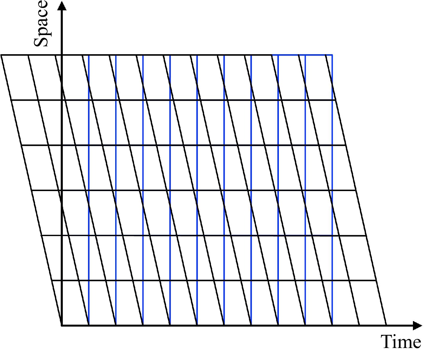
Figure 1.
Offset comparison between pTS diagram and rTS diagram.
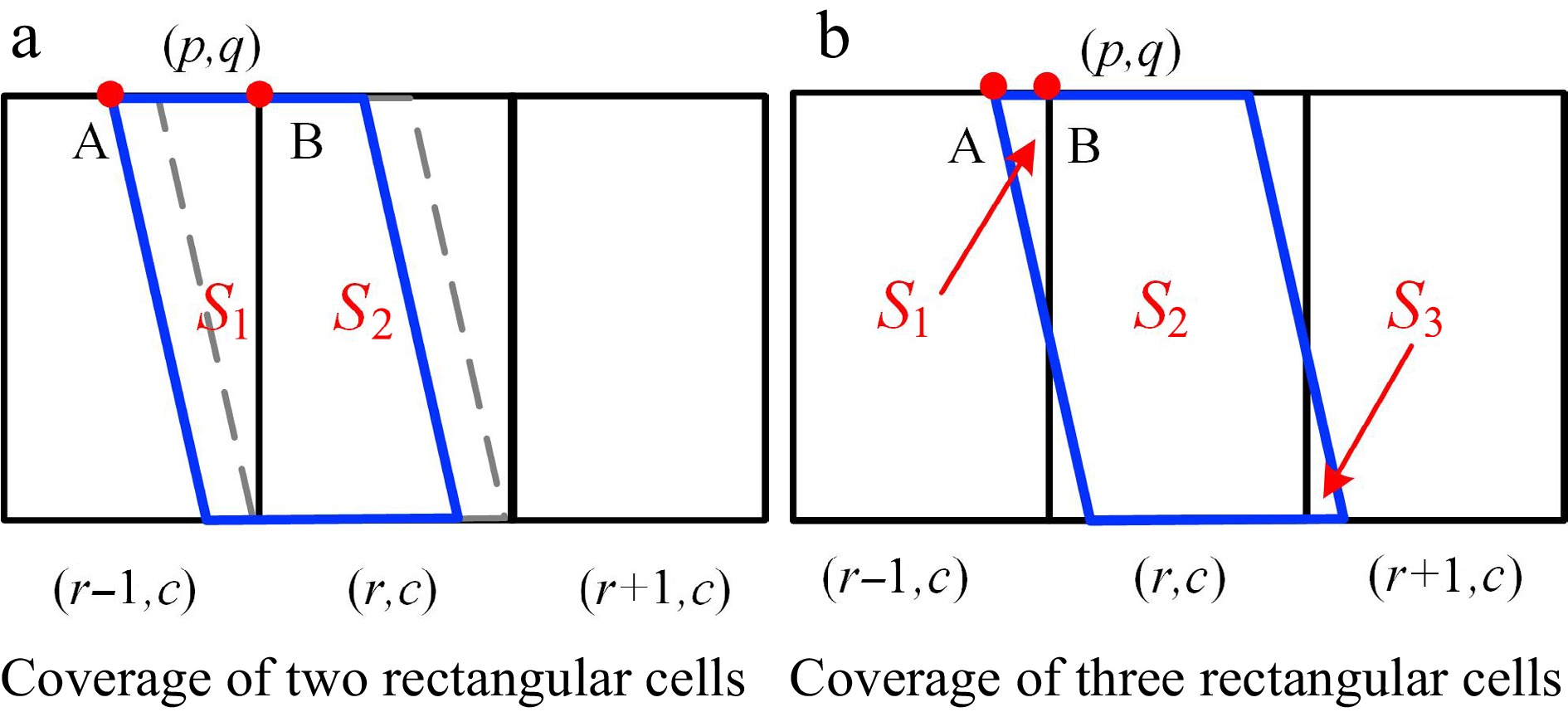
Figure 2.
Intersection pattern of congested flow state cellular units.
$ \mathrm{d}\mathrm{e}\mathrm{v}=\left|\dfrac{h}{k}\right| $ (1) $ {X}_{R(r,c)}^{LU}={X}_{P(p,q)}^{LU}+n\times dev $ (2) $ \mathrm{r}=\mathrm{q}+[\left(\mathrm{n}\times \mathrm{d}\mathrm{e}\mathrm{v}\right)/\mathrm{w}] $ (3) As shown in Fig. 2, the horizontal coordinate of red point A is
$ {X}_{P(p,q)}^{LU} $ $ {X}_{R(r,c)}^{LU} $ If
$ {X}_{R(r,c)}^{LU}-{X}_{P(p,q)}^{LU}\ge dev $ $ {V}_{R(r-1,c)} $ $ {V}_{R(r,c)} $ $ {V}_{R(r+1,c)} $ $ {V}_{P(p,q)}=\dfrac{{S}_{1}}{S}\times {V}_{R(r-1,c)}+\dfrac{{S}_{2}}{S}\times{V}_{R(r,c)} $ (4) If
$ {X}_{R(r,c)}^{LU}-{X}_{P(p,q)}^{LU} < dev $ $ {V}_{P(p,q)}=\dfrac{{S}_{1}}{S}\times{V}_{R(r-1,c)}+\dfrac{{S}_{2}}{S}\times{V}_{R(r,c)}+\dfrac{{S}_{3}}{S}\times{V}_{R(r+1,c)} $ (5) In summary, the pTS diagram calculates the average speed for each cell based on the weighted coverage of the rTS diagram. Subsequently, these individual cells are colored to form the pTS diagram. The cells tilted to the lower-right represent the congested portion of the pTS diagram. Therefore, we refer to this approach as the area-weighted transformation method for converting TS diagrams.
-
To evaluate the accuracy and effectiveness of the method, we conducted a validation using the ZenTraffic dataset. The dataset comprises two high-fidelity trajectory datasets of highway segments, namely Wangan-Route-4 and Ikeda-Route-11[35].
The Wangan-Route-4 dataset encompasses trajectory data collected from the Ohama-Sambo section of the Hanshin Expressway Route 4, covering a route length of approximately 1.6 km. This dataset continuously records trajectory data from two lanes over a 5-h duration. Conversely, the Ikeda-Route-11 dataset is located along the Hanshin Expressway Route 11 Ikeda Line, near the Tsukamoto Junction. It spans a route length of approximately 2 km and similarly captures trajectory data from two lanes throughout a 5-h period. Both datasets include essential attributes such as vehicle ID, timestamp, distance traveled, and operating speed. Each hourly vehicle trajectory dataset comprises a mix of free-flow and congested traffic states, effectively representing typical traffic flow characteristics. This rich dataset is well-suited for conducting comprehensive research on traffic states, including flow, speed, and density analysis.
Evaluation metrics
-
To rigorously validate the accuracy of the area-weighted transformation method and perform a comprehensive quantitative analysis, we extract travel times from both rTS diagrams and pTS diagrams. These extracted travel times are subsequently compared to the ground truth travel times using the Mean Absolute Percentage Error (MAPE) metric. The validation procedure commences by establishing the trajectory's starting point at the corresponding timestamp, serving as the initial reference point. The average speed associated with each cell serves as the slope for the trajectory segment, enabling the computation of the subsequent trajectory point. This iterative process continues until the final trajectory endpoint is reached. The time difference between the starting and ending timestamps of the trajectory is considered the estimated travel time. We selectively choose specific vehicle trajectories falling within a predetermined length range to ensure a meaningful comparative analysis. Figure 3 provides a schematic representation of this method. This methodology enables us to quantitatively evaluate the performance of the area-weighted transformation method by directly comparing estimated travel times derived from the transformed pTS diagrams with ground truth travel times obtained from the original rTS diagrams.
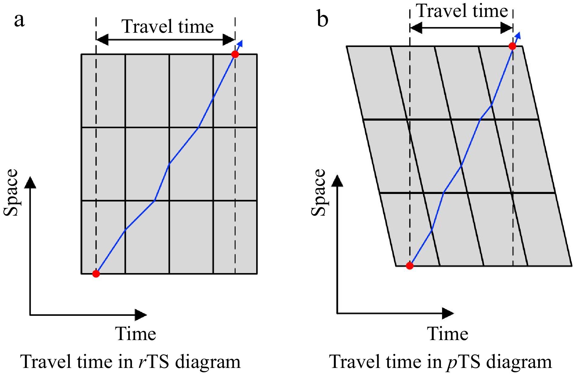
Figure 3.
Methods for calculating travel time in different spatiotemporal diagrams.
The vehicle's travel trajectory is reconstructed to obtain travel times in both the rTS diagram and pTS diagram scenarios. To evaluate the effectiveness of this metric, we calculate the Mean Absolute Percentage Error (MAPE) for travel times in both the rTS diagram and pTS diagram conditions using the following formula:
$ {MAPE}_{j}=\dfrac{100{{\mathrm{\%}}}}{N}\displaystyle\sum\nolimits _{i=1}^{n}\left|\dfrac{{y}_{i}^{j}-{y}_{i}}{{y}_{i}}\right| $ (6) where, j = {1,2} represents rTS diagrams and pTS diagrams, N represents the total number of trajectories,
$ {y}_{i}^{j} $ $ {y}_{i} $ ${\Delta}{M}={MAPE}_{1}-{MAPE}_{2} $ (7) If ΔM is greater than 0, it indicates that the average absolute percentage error derived from the rTS diagram is higher, demonstrating the superior performance of the area-weighted transformation method using the pTS diagrams. Conversely, if ΔM is less than 0, it implies that the rTS diagram provides more accurate travel time calculations and performs better.
Experimental results
-
At the beginning of the experiment, trajectory data undergoes preprocessing, involving the mapping of trajectory points from two datasets into rectangular cells of varying dimensions. Because of variations in the upload intervals of information detected by road detectors, we conduct experiments using cell sizes of 60 s × 50 m, 60 s × 100 m, 120 s × 100 m, 120 s × 200 m, 240 s × 200 m, and 240 s × 400 m. The average speed of trajectory points within each cell is calculated, and color rTS diagrams are based on the results. A study revealed that the propagation speed of traffic congestion waves ranged from −10 to −20 km/h[34]. After computation, the propagation speed of congestion in both datasets is found to be −16 km/h. This value is utilized as the slope for generating pTS diagrams using the area-weighted transformation method. Figure 4 shows TS diagrams of lane 1 (F1L1) and lane 2 (F1L2) during the first hour within the Ikeda-Route-11 dataset. The corresponding cell sizes are 60 s × 100 m and 120 s × 200 m, respectively. It includes TS diagrams of high-fidelity trajectories, the rTS diagrams constructed using the trajectories, and the pTS diagrams directly transformed from the rTS diagrams.
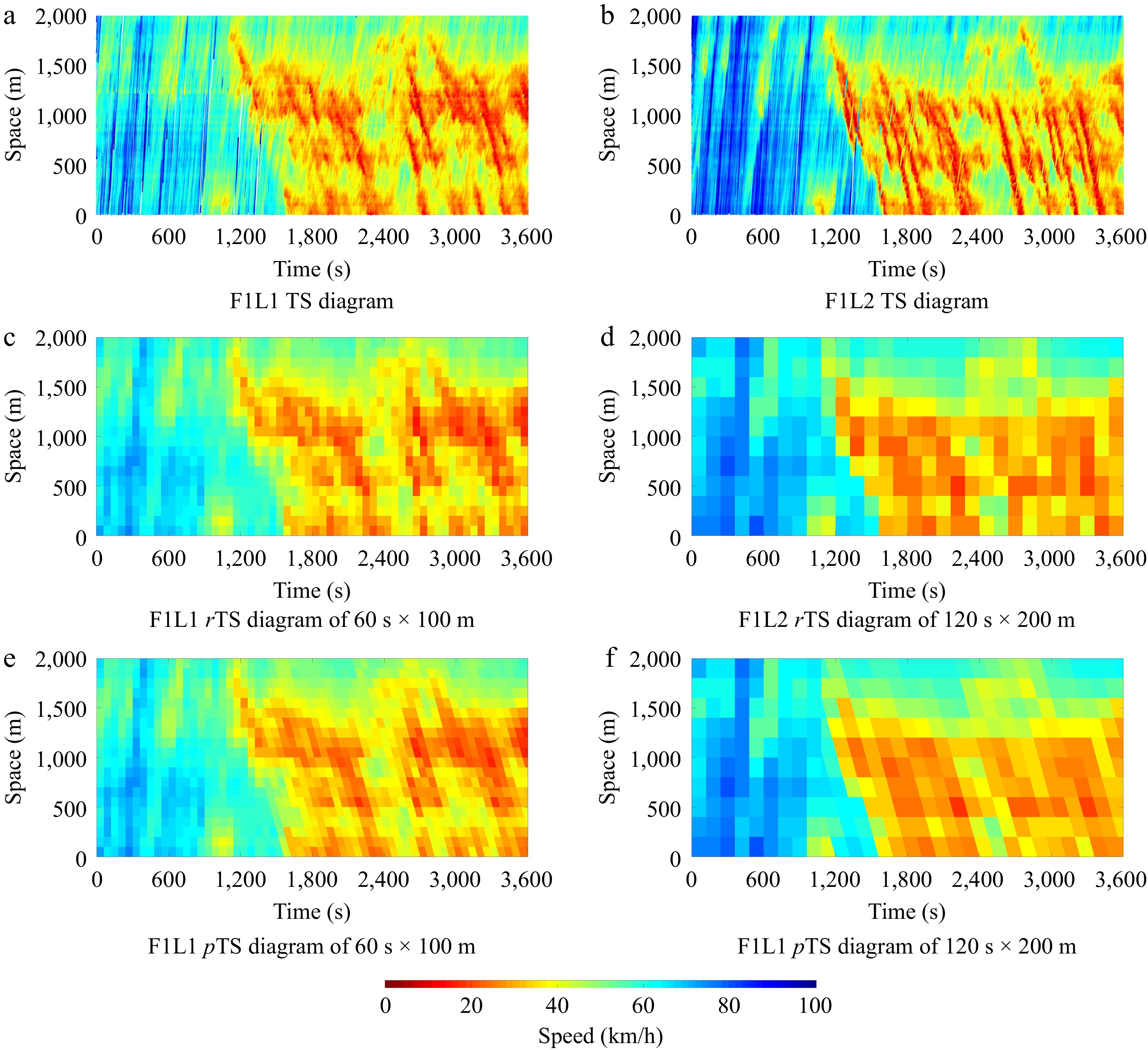
Figure 4.
Diagrams with a cell size of 60 s × 100 m and 120 s × 200 m.
A comparative analysis of the images demonstrates significant differences when transitioning from an rTS diagram to a pTS diagram. Notably, these changes are more pronounced in regions characterized by higher congestion levels. In particular, pTS diagrams exhibit enhanced continuity, especially when dealing with skewed features. They excel in preserving the representation of traffic propagation patterns and demonstrate relatively uniform traffic states across cellular units, thereby meeting the criteria for homogeneous traffic flow.
-
To further evaluate the area-weighted transformation method, we compute travel times and their corresponding MAPE based on rTS diagrams and pTS diagrams, the specific data can be found in Tables 1 & 2.
Table 1. Wangan-Route-4 indicator results (%).
Cell size Zen4 F1L1 F1L2 F2L1 F2L2 F3L1 F3L2 F4L1 F4L2 F5L1 F5L2 60 s × 50 m MAPE1 2.726 2.456 2.583 2.710 2.448 2.730 2.814 2.795 2.832 3.348 MAPE2 2.634 2.423 2.155 1.874 2.194 1.976 2.732 2.363 2.502 2.329 ΔM 0.092 0.034 0.428 0.836 0.253 0.754 0.082 0.432 0.330 1.019 60 s × 100 m MAPE1 2.944 2.726 3.052 3.079 2.933 3.098 3.317 3.298 3.34 3.735 MAPE2 2.898 2.715 2.916 2.194 2.706 2.373 3.245 2.871 2.895 2.918 ΔM 0.046 0.011 0.136 0.884 0.227 0.724 0.071 0.428 0.445 0.816 120 s × 100 m MAPE1 3.623 3.179 3.700 3.061 3.669 3.298 3.969 3.598 3.991 5.006 MAPE2 3.453 3.138 3.277 2.727 3.265 3.171 3.665 3.231 3.795 4.088 ΔM 0.170 0.041 0.423 0.334 0.405 0.126 0.304 0.367 0.196 0.917 120 s × 200 m MAPE1 6.318 4.054 6.664 4.623 6.174 4.321 6.254 5.019 6.656 6.048 MAPE2 6.074 3.603 6.29 3.991 5.572 4.105 5.943 4.56 6.345 5.078 ΔM 0.244 0.451 0.374 0.632 0.602 0.216 0.311 0.459 0.311 0.97 240 s × 200 m MAPE1 6.700 4.989 6.742 4.052 6.462 5.922 6.514 4.444 6.579 4.126 MAPE2 6.661 4.961 6.317 3.802 5.768 5.446 6.256 4.358 6.519 4.062 ΔM 0.040 0.027 0.425 0.250 0.694 0.476 0.258 0.086 0.060 0.064 240 s × 400 m MAPE1 10.704 8.645 10.981 8.315 11.1 9.68 10.633 7.907 11.521 9.298 MAPE2 10.456 8.562 10.482 7.837 10.445 9.216 10.306 7.807 11.271 9.263 ΔM 0.248 0.083 0.5 0.478 0.655 0.464 0.327 0.1 0.25 0.034 Table 2. Ikeda-Route-11 indicator results (%).
Cell size Zen11 F1L1 F1L2 F2L1 F2L2 F3L1 F3L2 F4L1 F4L2 F5L1 F5L2 60 s × 50 m MAPE1 2.069 3.216 2.252 3.406 3.135 3.694 2.200 3.967 3.707 4.418 MAPE2 1.770 2.310 1.846 2.164 2.528 3.250 1.838 3.003 2.588 2.881 ΔM 0.299 0.906 0.406 1.242 0.607 0.444 0.362 0.965 1.119 1.537 60 s × 100 m MAPE1 2.312 3.484 2.443 3.553 2.866 3.41 2.748 3.165 4.009 4.501 MAPE2 2.067 2.591 2.029 2.356 2.474 2.757 2.65 3.115 2.854 3.001 ΔM 0.245 0.893 0.414 1.197 0.392 0.653 0.097 0.05 1.155 1.5 120 s × 100 m MAPE1 2.723 4.457 2.688 3.708 3.902 4.159 4.505 4.967 3.639 4.262 MAPE2 2.229 3.621 2.333 2.862 3.822 3.949 3.947 4.798 3.044 3.172 ΔM 0.494 0.836 0.354 0.846 0.080 0.210 0.558 0.169 0.595 1.090 120 s × 200 m MAPE1 3.444 4.857 3.557 4.608 3.841 4.528 4.834 5.275 4.459 4.706 MAPE2 3.067 3.535 3.319 3.719 3.384 4.376 4.266 5.164 3.875 3.851 ΔM 0.377 1.322 0.237 0.889 0.457 0.152 0.568 0.111 0.583 0.855 240 s × 200 m MAPE1 4.000 4.965 3.805 4.676 4.760 6.861 5.651 6.947 4.823 5.383 MAPE2 3.335 4.520 3.333 3.642 4.658 6.712 5.520 6.606 3.648 5.166 ΔM 0.666 0.445 0.472 1.034 0.101 0.149 0.131 0.341 1.174 0.217 240 s × 400 m MAPE1 6.22 6.716 6.455 6.446 8.807 8.87 7.573 7.725 7.126 6.965 MAPE2 5.292 6.199 5.781 5.427 7.126 7.985 7.521 7.545 5.853 6.389 ΔM 0.928 0.517 0.674 1.019 1.681 0.885 0.052 0.18 1.273 0.576 Observing Tables 1 & 2 reveals a close match in MAPE between corresponding lanes at the same time in both rTS and pTS diagrams. This suggests that the pTS diagram is derived from the rTS diagram, and the conclusions drawn are similar to those of the rTS diagram. However, it's noteworthy that all ΔM values are greater than 0, indicating that the travel times computed from pTS diagrams exhibit smaller errors and are closer to the actual travel times. This finding further implies that pTS diagrams excel in depicting congested traffic flow. As illustrated in the tables, whether in rTS or pTS diagrams, the MAPE increases with larger cell sizes, signifying that larger cells contain less trajectory information and result in increased errors compared to smaller cells. Despite the variation in cell size, ΔM does not exhibit a systematic trend, suggesting that pTS diagrams are not significantly influenced by cell size factors when representing congestion.
Considering that the flow direction in the free-flow differs from that in the congestion, we make attempts to change the orientation of the parallelogram to the upper-right direction for drawing the free-flow of the pTS diagram. Verification is also conducted using the travel time metric, and the results demonstrated that the rTS diagram performs better in depicting free-flow conditions under the travel time metric. The discrepancy in performance could be attributed to the fact that the propagation speed of free-flow traffic is not constrained to a specific range, unlike congestion. When attempting to substitute free-flow propagation with a single fixed speed, it results in increased errors in generating pTS diagrams. We conduct experiments by varying different propagation speed values and find that the advantage of the congestion section's pTS diagrams cannot offset the error in the free flow section's pTS diagrams. Future work will consider conducting further validation in terms of image similarity.
-
This study introduces an area-weighted TS diagram transformation method that effectively translates rTS diagrams into pTS diagrams, offering a novel approach to visualize traffic flow patterns. The method determines the coverage of pTS cells over rTS cells based on different coverage conditions. It portrays cell traffic states by calculating the average speed of trajectory points within each cell and applying area ratios as weighting factors for color filling. It calculates the average speed of trajectory points within each cell and uses area ratios as weighting factors for color filling. For experimentation and validation, we selected the Wangan-Route-4 and Ikeda-Route-11 datasets from ZenTraffic. We assessed the similarity between the transformed diagrams and the original trajectory-based diagrams through travel time comparisons, quantifying the Mean Absolute Percentage Errors (MAPEs) to analyze the associated errors. The results confirm the feasibility of this method in TS diagram transformation, especially in congested conditions. The pTS diagrams possess inherent features for visually representing traffic flow states, particularly when illustrating the slope of traffic wave propagation rates, which offers a more intuitive depiction of wave propagation processes.
The adoption of pTS diagrams effectively tackles the challenge posed by the discrete distribution of trajectory data values. It accomplishes this by grouping trajectory points within cell units, resulting in a more aggregated representation of traffic data. Moreover, the optimized pTS diagrams offer an enhanced depiction of traffic flow conditions on road segments. They serve as a basis for identifying traffic bottlenecks, formulating policies to alleviate traffic congestion, and ultimately enhancing urban traffic conditions. The direct transformation of rTS diagrams into pTS diagrams simplifies the otherwise intricate data processing needed for redrawing pTS diagrams. This approach provides an alternative display method for existing rTS diagrams, thereby maximizing the utilization of diverse data sources and harnessing the visualization advantages offered by pTS diagrams. These attributes highlight the importance of this approach in practical applications and scientific research.
The research is funded by National Natural Science Foundation of China (71871010).
-
The authors confirm contribution to the paper as follows: conceptualization: Wang N, Wang X; methodology: He Z, Wang N; validation, Wang X, Yan H; manuscript draft preparation: Wang N, Yan H; manuscript review and editing: Yan H, Wang N. All authors reviewed the results and approved the final version of the manuscript.
-
The data that support the findings of this study are available in the public domain: https://zen-traffic-data.net/english/.
-
The authors declare that they have no conflict of interest. Hai Yan is the Editorial Board member of Digital Transportation and Safety who was blinded from reviewing or making decisions on the manuscript. The article was subject to the journal’s standard procedures, with peer-review handled independently of this Editorial Board member and the research groups.
- Copyright: © 2024 by the author(s). Published by Maximum Academic Press, Fayetteville, GA. This article is an open access article distributed under Creative Commons Attribution License (CC BY 4.0), visit https://creativecommons.org/licenses/by/4.0/.
-
About this article
Cite this article
Wang N, Wang X, Yan H, He Z. 2024. From rectangle to parallelogram: an area-weighted method to make time-space diagrams incorporate traffic waves. Digital Transportation and Safety 3(1): 1−7 doi: 10.48130/dts-0024-0001 

From rectangle to parallelogram: an area-weighted method to make time-space diagrams incorporate traffic waves
- Received: 01 November 2023
- Revised: 05 January 2024
- Accepted: 12 January 2024
- Published online: 28 March 2024
Abstract: A time-space (TS) traffic diagram is one of the most important tools for traffic visualization and analysis. Recently, it has been empirically shown that using parallelogram cells to construct a TS diagram outperforms using rectangular cells due to its incorporation of traffic wave speed. However, it is not realistic to immediately change the fundamental method of TS diagram construction that has been well embedded in various systems. To quickly make the existing TS diagram incorporate traffic wave speed and exhibit more realistic traffic patterns, the paper proposes an area-weighted transformation method that directly transforms rectangular-cell-based TS (rTS) diagrams into parallelogram-cell-based TS (pTS) diagrams, avoiding tracing back the raw data of speed to make the transformation. Two five-hour trajectory datasets from Japanese highway segments are used to demonstrate the effectiveness of the proposed methods. The travel time-based comparison involves assessing the disparities between actual travel times and those computed using rTS diagrams, as well as travel times derived directly from pTS diagrams based on rTS diagrams. The results show that travel times calculated from pTS diagrams converted from rTS diagrams are closer to the actual values, especially in congested conditions, demonstrating superior performance in parallelogram representation. The proposed transformation method has promising prospects for practical applications, making the widely-existing TS diagrams show more realistic traffic patterns.
-
Key words:
- Spatiotemporal speed contour diagram /
- Vehicle trajectory /
- Traffic wave /
- Traffic state